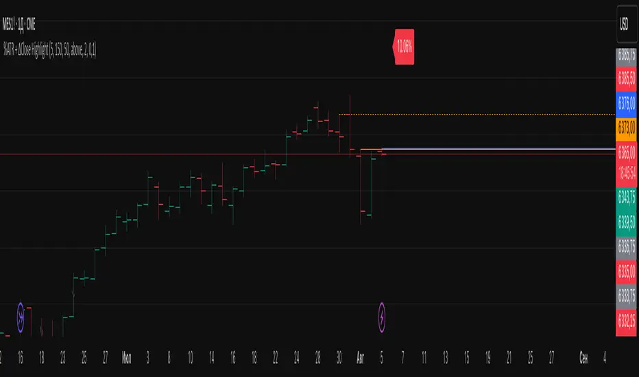
Sri Yantra MTF - AynetSri Yantra MTF - Aynet Script Overview
This Pine Script generates a Sri Yantra-inspired geometric pattern overlay on price charts. The pattern is dynamically updated based on multi-timeframe (MTF) inputs, utilizing high and low price ranges, and adjusting its size relative to a chosen multiplier.
The Sri Yantra is a sacred geometric figure used in various spiritual and mathematical contexts, symbolizing the interconnectedness of the universe. Here, it is applied to visualize structured price levels.
Scientific and Technical Explanation
Multi-Timeframe Integration:
Base Timeframe (baseRes): This is the primary timeframe for the analysis. The opening price and ATR (Average True Range) are calculated from this timeframe.
Pattern Timeframe (patternRes): Defines the granularity of the pattern. It ensures synchronization with price movements on specific time intervals.
Geometric Construction:
ATR-Based Scaling: The script uses ATR as a volatility measure to dynamically size the geometric pattern. The sizeMult input scales the pattern relative to price volatility.
Pattern Width (barOffset): Defines the horizontal extent of the pattern in terms of bars. This ensures the pattern is aligned with price movements and scales appropriately.
Sri Yantra-Like Geometry:
Outer Square: A bounding box is drawn around the price level.
Triangles: Multiple layers of triangles (primary, secondary, and tertiary) are calculated and drawn to mimic the structure of the Sri Yantra. These triangles converge and diverge based on price levels.
Horizontal Lines: Added at key levels to provide additional structure and aesthetic alignment.
Dynamic Updates:
The pattern recalculates and redraws itself on the last bar of the selected timeframe, ensuring it adapts to real-time price data.
A built-in check identifies new bars in the chosen timeframe (patternRes), ensuring accurate updates.
Information Table:
Displays the selected base and pattern timeframes in a table format on the top-right corner of the chart.
Allows traders to see the active settings for quick adjustments.
Key Inputs
Style Settings:
Pattern Color: Customize the color of the geometric patterns.
Size Multiplier (sizeMult): Adjusts the size of the pattern relative to price movements.
Line Width: Controls the thickness of the geometric lines.
Timeframe Settings:
Base Resolution (baseRes): Timeframe for calculating the pattern's anchor (default: daily).
Pattern Resolution (patternRes): Timeframe granularity for the pattern’s formation.
Geometric Adjustments:
Pattern Width (barOffset): Horizontal width in bars.
ATR Multiplier (rangeSize): Vertical size adjustment based on price volatility.
Scientific Concepts
Volatility Representation:
ATR (Average True Range): A standard measure of market volatility, representing the average range of price movements over a defined period. Here, ATR adjusts the vertical height of the geometric figures.
Geometric Symmetry:
The script emulates symmetry similar to the Sri Yantra, aligning with the principles of sacred geometry, which often appear in nature and mathematical constructs. Symmetry in financial data visualizations can aid in intuitive interpretation of price movements.
Multi-Timeframe Fusion:
Synchronizing patterns with multiple timeframes enhances the relevance of overlays for different trading strategies. For example, daily trends combined with hourly patterns can help traders optimize entries and exits.
Visual Features
Outer Square:
Drawn to encapsulate the geometric structure.
Represents the broader context of price levels.
Triangles:
Three layers of interlocking triangles create a fractal pattern, providing a visual alignment to price dynamics.
Horizontal Lines:
Emphasize critical levels within the pattern, offering visual cues for potential support or resistance areas.
Information Table:
Displays the active timeframe settings, helping traders quickly verify configurations.
Applications
Trend Visualization:
Patterns overlay on price movements provide a clearer view of trend direction and potential reversals.
Volatility Mapping:
ATR-based scaling ensures the pattern adjusts to varying market conditions, making it suitable for different asset classes and trading strategies.
Multi-Timeframe Analysis:
Integrates higher and lower timeframes, enabling traders to spot confluences between short-term and long-term price levels.
Potential Enhancements
Add Fibonacci Levels: Overlay Fibonacci retracements within the pattern for deeper price level insights.
Dynamic Alerts: Include alert conditions when price intersects key geometric lines.
Custom Labels: Add text descriptions for critical intersections or triangle centers.
This script is a unique blend of technical analysis and sacred geometry, providing traders with an innovative way to visualize market dynamics.
在脚本中搜索" TABLE "
BTX27-MAXIndicator Description: BTX27-MAX
The BTX27-MAX is a comprehensive trading indicator designed to provide traders with customizable signals and alerts based on RSI and ATR calculations. It offers both automatic and manual configurations, making it adaptable to various currency pairs and trading styles. The indicator integrates with Telegram for real-time alerts and includes features for trade management and performance tracking.
Key Features:
Customizable Color Themes: Choose between Dark and Light color styles to match your chart preferences.
Automatic or Manual Configuration: Automatically sets optimal parameters for selected currency pairs or allows manual input for personalized settings.
RSI and ATR-Based Signals: Utilizes RSI smoothing and ATR calculations to identify potential trading opportunities.
Automatic SL and TP Levels: Projects customizable Stop-Loss and Take-Profit levels directly on the chart.
Telegram Integration: Sends customized buy or sell alerts with trade details to your Telegram channel.
Day and Time Filters: Allows selection of trading days and specific trading hours for signal generation.
Trade Summary Table: Displays the results of the last three trades (Win/Loss) directly on the chart.
Customizable Alert Messages: Personalize the messages sent to Telegram for both buy and sell signals.
Visual Enhancements: Colors candles based on trend direction and highlights the trading session on the chart.
How Does the Indicator Work?
Color Style Selection:
- Choose between "Dark" or "Light" themes to match your chart setup.
Currency Pair Selection:
- Select from predefined currency pairs: "EURUSD M5", "USDCAD M3", "GBPUSD M9", "XAUUSD M9".
Automatic vs. Manual Configuration:
- Automatic Configuration: When enabled, the indicator automatically sets parameters optimized for the selected currency pair.
- Manual Configuration: Allows you to input your own parameters for RSI period, smoothing factor, liquidity factors, and SL/TP ticks.
Telegram Integration:
- Input your Telegram chat ID to receive real-time alerts when signals are generated.
Trading Days and Hours:
- Customize which days of the week you want to receive signals.
- Set specific trading start and end hours to focus on preferred trading sessions.
Indicator Calculations:
- Calculates RSI and applies smoothing to identify the trend.
- Uses ATR for volatility measurement and to set dynamic liquidity bands.
Signal Generation:
- A Buy Signal is generated when specific RSI and ATR conditions are met.
- A Sell Signal is generated under the opposite conditions.
- Signals are only generated during the specified trading days and hours.
Trade Execution Visuals:
- Automatically draws SL and TP boxes on the chart for each signal.
- Colors candles based on trend direction: bullish, bearish, or neutral.
Telegram Alerts:
- Sends customized messages to your Telegram channel, including trade details like entry price, SL, TP, volatility, and trend direction.
Trade Summary Table:
- Displays the results of the last three trades ("✅ TP" for Take Profit hit, "❌ SL" for Stop Loss hit) on the chart.
How to Use the Indicator?
Setup:
- Add the indicator to your TradingView chart.
- Choose your preferred Color Style (Dark or Light).
- Select the Currency Pair you are trading.
- Decide whether to use Automatic Configuration or input your own settings.
Configure Telegram Alerts:
- Input your Telegram Chat ID to receive alerts.
- Customize the Buy and Sell alert messages if desired.
Set Trading Days and Hours:
- Enable or disable trading on specific days of the week.
- Set your preferred trading session hours.
Monitor Signals:
- Watch for buy or sell labels appearing on the chart.
- Use the SL and TP boxes to plan your trade entries and exits.
Review Trade Performance:
- Check the trade summary table to see the outcomes of recent trades.
What Makes This Indicator Original?
Adaptable Configuration: Offers both automatic and manual settings, making it suitable for traders of all levels and various trading instruments.
Comprehensive Alerts: Provides detailed alerts via Telegram, including custom messages and comprehensive trade information.
Trade Management Tools: Automatically calculates and visualizes SL and TP levels, aiding in effective risk management.
Performance Tracking: Includes an on-chart summary of recent trade results, helping traders assess the indicator's effectiveness over time.
Visual Customization: Enhances chart visuals with color themes, candle coloring, and trading session highlights.
Additional Considerations
Testing and Optimization: Before using the indicator in live trading, test it in a demo account and adjust settings as needed.
Complementary Analysis: Use in conjunction with other technical or fundamental analysis tools to confirm signals.
Risk Management: Ensure that the automatically calculated SL and TP levels align with your risk tolerance and trading strategy.
Market Awareness: Stay informed about economic events that may impact the instruments you are trading.
Example Configuration
Assuming you are trading "EURUSD M5" with Automatic Configuration enabled:
RSI Period: 15
RSI Smoothing Factor: 14
Rapid Liquidity Factor: 2.238
Liquidity Threshold: 15
SL Ticks: 100
TP Ticks: 300
Trading Days: Tuesday, Wednesday, Thursday
Trading Hours: Start at 8:00, End at 10:00
Telegram Chat ID: Your unique Telegram chat ID
Conclusion
The BTX27-MAX indicator is a versatile tool that combines technical analysis with automated trade management and alerting features. Its adaptability through automatic and manual configurations makes it suitable for a wide range of trading styles and instruments. By integrating real-time Telegram alerts and providing on-chart visual aids, it enhances decision-making processes and helps traders manage their trades more effectively.
Ready for immediate use in TradingView, this indicator can be a valuable addition to your trading toolkit.

Trend, Momentum and Price value analysis [deepakks444]Trend, Momentum, and Price Value Analysis
This indicator combines several key technical analysis tools to help traders evaluate the market's trend strength, momentum, and overall price behavior. It uses a variety of signals to generate a "Buy," "Sell," or "No Clear Indication" based on multiple indicators and plots them directly on the chart. A customizable table also summarizes these signals, making it easy to interpret the market conditions in real-time.
Key Features:
VWAP (Volume-Weighted Average Price): Indicates whether the price is above or below the VWAP line, helping to identify buying or selling opportunities based on fair value.
Alligator Indicator: Utilizes three simple moving averages (SMAs) to track trend direction, providing a clear "Buy" or "Sell" signal when the averages are aligned.
Supertrend: A widely-used trend-following indicator, this script identifies potential buy or sell zones based on the price's relationship with the Supertrend line.
20-period Moving Average (MA): A simple moving average to track the overall trend direction. The signal is based on the price crossing above or below the MA.
ADX (Average Directional Index): Measures the strength of the trend. A reading above 25 indicates a "Buy" signal, while a reading below suggests a "Sell."
RSI (Relative Strength Index): Generates a buy signal when RSI exceeds 60 and a sell signal when it drops below 40. Values between 40 and 60 indicate a neutral condition.
MACD (Moving Average Convergence Divergence): Provides a signal for buying when the MACD line crosses above the signal line, and selling when it crosses below.
Volume Signal: Compares current volume against the 20-period moving average to identify significant volume spikes. This helps in determining if the market is supported by strong volume.
Customization Options:
Moving Average Length: Customize the 20-period MA length to better fit your trading style or the asset you’re analyzing.
Supertrend Settings: Adjust the Supertrend factor and ATR period for different timeframes or volatility environments.
Table Position: Customize where the signal table is displayed on the chart (Top Right, Top Left, Bottom Right, or Bottom Left).
Table Appearance: Set the table background color and choose between small or tiny text size for better readability.
Signal Summary:
The indicator computes a combined signal based on the number of "Buy" or "Sell" signals from the individual indicators. If 5 or more indicators suggest a "Buy" or "Sell," the table will display a combined signal for easier decision-making. This feature consolidates the signals into one straightforward output, helping you filter noise and act on clear trends.
Table Display:
The customizable table organizes the signals of the key indicators, showing:
Indicator: Lists all the indicators in use, such as VWAP, Alligator, Supertrend, etc.
Signal: Displays "Buy," "Sell," or "Neutral" for each indicator based on the current market conditions.
Intended Use:
This script is designed to help traders monitor multiple technical indicators at once, giving them a clearer view of the market’s trend strength, momentum, and volatility. While it simplifies the process of interpreting various signals, users should use it in combination with their own research and risk management strategies.
Disclaimer: This script is for educational purposes only and should not be considered financial advice. All trading involves risk, and the performance of an indicator in the past does not guarantee future results. Always perform due diligence and use proper risk management techniques.
3 days ago
Release Notes
A "Buy" triangle is plotted below the bar if the signal changes to "Buy".
A "Sell" triangle is plotted above the bar if the signal changes to "Sell".
Script Name: Trend, Momentum, and Price Value Analysis
The Trend, Momentum, and Price Value Analysis script provides a multi-faceted approach to market analysis, combining several technical indicators into a single tool. This script offers an easy-to-interpret table summarizing various indicator signals, along with visual buy/sell signals on the chart.
Key Features:
VWAP (Volume Weighted Average Price):
The VWAP provides insights into whether the current price is above or below the average weighted price, helping traders identify potential buy or sell opportunities.
Alligator Indicator (Simplified):
Using three simple moving averages (SMAs), this tool helps identify the beginning of trends and potential buy/sell zones based on the Alligator jaw, teeth, and lips.
Supertrend:
A trend-following indicator that determines whether the market is in a bullish or bearish phase based on ATR and factor inputs. The Supertrend line is plotted on the chart.
20-period Moving Average (MA):
A basic moving average that assists in gauging price direction and the overall trend.
ADX (Average Directional Index):
Helps identify the strength of a trend. A value above 25 indicates a strong trend.
RSI (Relative Strength Index):
Measures momentum by identifying overbought and oversold conditions. A signal is triggered when RSI is above 60 (buy) or below 40 (sell).
MACD (Moving Average Convergence Divergence):
A momentum indicator that provides signals when the MACD line crosses the signal line.
Volume Signal:
Compares the current volume with a 20-period average to determine if volume supports the current trend direction.
Signal Table:
A table is generated on the chart, displaying real-time signals from each of the above indicators. The table is customizable with background colors and text sizes.
The position of the table can be set to any corner of the chart for convenience.
Combined Signal Logic:
The script calculates a Combined Signal based on the majority of buy or sell signals across all the indicators. If 5 or more indicators give a buy or sell signal, a combined signal is generated.
Buy/Sell Signal Plots:
The script plots buy (green triangle) and sell (red triangle) signals on the chart based on the combined signal when transitioning from a previous opposite signal.
Customizable Inputs:
Users can customize the length of the moving averages, adjust the background and text colors of the table, and choose the position of the table on the chart.
Financial GrowthOverview
The script named "Financial Growth" is written in Pine Script v5.
It is designed to display various financial metrics and ratios in a tabular format on TradingView charts.
The code pulls financial data like revenue, net income, EPS, etc., and presents these metrics along with ratios such as P/E, D/E, and others.
The table can display these values for different time periods such as quarterly, yearly, or trailing twelve months (TTM).
Additionally, it can show QoQ (Quarter-over-Quarter), YoY (Year-over-Year), and CAGR (Compound Annual Growth Rate) changes for selected financial items.
The code includes plotting options for visual representation of financial data and labels.
Explanation of Code Sections
Revision Notes
The revision notes indicate changes made in different versions of the code.
Each version update introduces new financial metrics and code restructuring.
Indicator Definition
indicator("Financial Growth", overlay=false, format=format.volume): Defines a standalone indicator with the name "Financial Growth". The overlay=false parameter ensures it is not overlaid on the chart but shown in a separate panel.
Text Sizes and Table Positions
Different text sizes and table positions are defined using variables such as text_size_SMALL, tb_pos_POS01, etc.
These variables help in formatting the visual display of the table and labels.
Financial Items
The script defines several financial items like revenue, net income, EPS, EBITDA, debt, and ratios such as ROE, ROA, and D/E.
Each financial item is assigned a corresponding unique identifier, e.g., _revenue_id = 'TOTAL_REVENUE'.
Calculated Financial Ratios
Ratios such as P/E, P/BV, P/S, and P/FCF are calculated using:
price_to_earning
price_to_book_value
price_to_sales
price_to_free_cash_flow
These calculations are done using request.financial function calls.
User Inputs
The code uses input functions to allow users to select financial items and time periods:
financial_item_selection_01 and financial_item_selection_02 enable the selection of financial metrics.
period_selection allows users to choose between periods like FQ (Fiscal Quarter), FY (Fiscal Year), and TTM (Trailing Twelve Months).
Users can control the table's visibility and the display of QoQ, YoY, and CAGR changes using input.bool() settings.
Financial Data Retrieval
The function retreive_financial_data(_financial_item, _period) retrieves financial data based on the selected financial item and period.
It uses the request.financial function to get data for a specific ticker.
Table Creation and Formatting
The script uses table.new() to create a table for displaying financial data.
The table’s headers and values are populated using custom functions like header_column, date_column, and value_column.
QoQ, YoY, and CAGR columns are conditionally displayed based on the user’s input settings.
Plotting Data
The script can also plot the selected financial metrics using the plot() function.
Labels for plotted data are created using the label.new() function.
Handling of Bar States
The barstate.islast condition ensures that the table and plots are only updated at the last bar state, which optimizes performance and prevents unnecessary calculations.
Code Formatting and Optimization
Proper use of variables, functions, and conditional statements adheres to TradingView’s guidelines for efficient Pine Script development.
The use of ignore_invalid_symbol=true in request.financial calls ensures the script handles non-existent financial data gracefully.
Key Functions
is_calculated_data(_financial_item)
Determines whether a given financial item is a calculated metric (e.g., P/E, P/BV) instead of being directly available from TradingView’s data.
get_financial_id(_financial_item)
Returns the financial identifier based on the selected item (e.g., TOTAL_REVENUE for revenue).
get_value_formating(_financial_item)
Returns the appropriate value divider, suffix, and formatting style based on the selected financial item.
create_array(arrayId, val)
Adds a new value to a specified array, used for storing historical financial data for table display.
get_cagr(_data_array, _id, _idmax)
Calculates the compound annual growth rate (CAGR) based on the given data array and index.

Stationarity Test: Dickey-Fuller & KPSS [Pinescriptlabs]
📊 Kwiatkowski-Phillips-Schmidt-Shin Model Indicator & Dickey-Fuller Test 📈
This algorithm performs two statistical tests on the price spread between two selected instruments: the first from the current chart and the second determined in the settings. The purpose is to determine if their relationship is stationary. It then uses this information to generate **visual signals** based on how far the current relationship deviates from its historical average.
⚙️ Key Components:
• 🧪 ADF Test (Augmented Dickey-Fuller):** Checks if the spread between the two instruments is stationary.
• 🔬 KPSS Test (Kwiatkowski-Phillips-Schmidt-Shin):** Another test for stationarity, complementing the ADF test.
• 📏 Z-Score Calculation:** Measures how many standard deviations the current spread is from its historical mean.
• 📊 Dynamic Threshold:** Adjusts the trading signal threshold based on recent market volatility.
🔍 What the Values Mean:
The indicator displays several key values in a table:
• 📈 ADF Stationarity:** Shows "Stationary" or "Non-Stationary" based on the ADF test result.
• 📉 KPSS Stationarity:** Shows "Stationary" or "Non-Stationary" based on the KPSS test result.
• 📏 Current Z-Score:** The current Z-score of the spread.
• 🔗 Hedge Ratio:** The relationship coefficient between the two instruments.
• 🌐 Market State:** Describes the current market condition based on the Z-score.
📊 How to Interpret the Chart:
• The main chart displays the Z-score of the spread over time.
• The green and red lines represent the upper and lower thresholds for trading signals.
• The area between the **Z-score** and the thresholds is filled when a trading signal is active.
• Additional charts show the **statistics of the ADF and KPSS tests** and their critical values.
**📉 Practical Example: NVIDIA Corporation (NVDA)**
Looking at the chart for **NVIDIA Corporation (NVDA)**, we can see how the indicator applies in a real case:
1. **Main Chart (Top):**
• Shows the **historical price** of NVIDIA on a weekly scale.
• A general **uptrend** is observed with periods of consolidation.
2. **KPSS & ADF Indicator (Bottom):**
• The lower chart shows the KPSS & ADF Model indicator applied to NVIDIA.
• The **green line** represents the Z-score of the spread.
• The **green shaded areas** indicate periods where the Z-score exceeded the thresholds, generating trading signals.
3. **📋 Current Values in the Table:**
• **ADF Stationarity:** Non-Stationary
• **KPSS Stationarity:** Non-Stationary
• **Current Z-Score:** 3.45
• **Hedge Ratio:** -164.8557
• **Market State:** Moderate Volatility
4. **🔍 Interpretation:**
• A Z-score of **3.45** suggests that NVIDIA’s price is significantly above its historical average relative to **EURUSD**.
• Both the **ADF** and **KPSS** tests indicate **non-stationarity**, suggesting **caution** when using mean reversion signals at this moment.
• The market state "Moderate Volatility" indicates noticeable deviation, but not extreme.
---
**💡 Usage:**
• **When Both Tests Show Stationarity:**
• **🔼 If Z-score > Upper Threshold:** Consider **buying the first instrument** and **selling the second**.
• **🔽 If Z-score < Lower Threshold:** Consider **selling the first instrument** and **buying the second**.
• **When Either Test Shows Non-Stationarity:**
• Wait for the relationship to become **stationary** before trading.
• **Market State:**
• Use this information to evaluate **general market conditions** and adjust your trading strategy accordingly.
**Mirror Comparison of the Same as Symbol 2 🔄📊**
**📊 Table Values:**
• **Extreme Volatility Threshold:** This value is displayed when the **Z-score** exceeds **100%**, indicating **extreme deviation**. It signals a potential **trading opportunity**, as the spread has reached unusually high or low levels, suggesting a **reversion or correction** in the market.
• **Mean Reversion Threshold:** Appears when the **Z-score** begins returning towards the mean after a period of **high or extreme volatility**. It indicates that the spread between the assets is returning to normal levels, suggesting a phase of **stabilization**.
• **Neutral Zone:** Displayed when the **Z-score** is near **zero**, signaling that the spread between assets is within expected limits. This indicates a **balanced market** with no significant volatility or clear trading opportunities.
• **Low Volatility Threshold:** Appears when the **Z-score** is below **70%** of the dynamic threshold, reflecting a period of **low volatility** and market stability, indicating fewer trading opportunities.
Español:
📊 Indicador del Modelo Kwiatkowski-Phillips-Schmidt-Shin & Prueba de Dickey-Fuller 📈
Este algoritmo realiza dos pruebas estadísticas sobre la diferencia de precios (spread) entre dos instrumentos seleccionados: el primero en el gráfico actual y el segundo determinado en la configuración. El objetivo es determinar si su relación es estacionaria. Luego utiliza esta información para generar señales visuales basadas en cuánto se desvía la relación actual de su promedio histórico.
⚙️ Componentes Clave:
• 🧪 Prueba ADF (Dickey-Fuller Aumentada): Verifica si el spread entre los dos instrumentos es estacionario.
• 🔬 Prueba KPSS (Kwiatkowski-Phillips-Schmidt-Shin): Otra prueba para la estacionariedad, complementando la prueba ADF.
• 📏 Cálculo del Z-Score: Mide cuántas desviaciones estándar se encuentra el spread actual de su media histórica.
• 📊 Umbral Dinámico: Ajusta el umbral de la señal de trading en función de la volatilidad reciente del mercado.
🔍 Qué Significan los Valores:
El indicador muestra varios valores clave en una tabla:
• 📈 Estacionariedad ADF: Muestra "Estacionario" o "No Estacionario" basado en el resultado de la prueba ADF.
• 📉 Estacionariedad KPSS: Muestra "Estacionario" o "No Estacionario" basado en el resultado de la prueba KPSS.
• 📏 Z-Score Actual: El Z-score actual del spread.
• 🔗 Ratio de Cobertura: El coeficiente de relación entre los dos instrumentos.
• 🌐 Estado del Mercado: Describe la condición actual del mercado basado en el Z-score.
📊 Cómo Interpretar el Gráfico:
• El gráfico principal muestra el Z-score del spread a lo largo del tiempo.
• Las líneas verdes y rojas representan los umbrales superior e inferior para las señales de trading.
• El área entre el Z-score y los umbrales se llena cuando una señal de trading está activa.
• Los gráficos adicionales muestran las estadísticas de las pruebas ADF y KPSS y sus valores críticos.
📉 Ejemplo Práctico: NVIDIA Corporation (NVDA)
Observando el gráfico para NVIDIA Corporation (NVDA), podemos ver cómo se aplica el indicador en un caso real:
Gráfico Principal (Superior): • Muestra el precio histórico de NVIDIA en escala semanal. • Se observa una tendencia alcista general con períodos de consolidación.
Indicador KPSS & ADF (Inferior): • El gráfico inferior muestra el indicador Modelo KPSS & ADF aplicado a NVIDIA. • La línea verde representa el Z-score del spread. • Las áreas sombreadas en verde indican períodos donde el Z-score superó los umbrales, generando señales de trading.
📋 Valores Actuales en la Tabla: • Estacionariedad ADF: No Estacionario • Estacionariedad KPSS: No Estacionario • Z-Score Actual: 3.45 • Ratio de Cobertura: -164.8557 • Estado del Mercado: Volatilidad Moderada
🔍 Interpretación: • Un Z-score de 3.45 sugiere que el precio de NVIDIA está significativamente por encima de su promedio histórico en relación con EURUSD. • Tanto la prueba ADF como la KPSS indican no estacionariedad, lo que sugiere precaución al usar señales de reversión a la media en este momento. • El estado del mercado "Volatilidad Moderada" indica una desviación notable, pero no extrema.
💡 Uso:
• Cuando Ambas Pruebas Muestran Estacionariedad:
• 🔼 Si Z-score > Umbral Superior: Considera comprar el primer instrumento y vender el segundo.
• 🔽 Si Z-score < Umbral Inferior: Considera vender el primer instrumento y comprar el segundo.
• Cuando Alguna Prueba Muestra No Estacionariedad:
• Espera a que la relación se vuelva estacionaria antes de operar.
• Estado del Mercado:
• Usa esta información para evaluar las condiciones generales del mercado y ajustar tu estrategia de trading en consecuencia.
Comparativo en Espejo del Mismo Como Símbolo 2 🔄📊
📊 Valores de la Tabla:
• Umbral de Volatilidad Extrema: Este valor se muestra cuando el Z-score supera el 100%, indicando desviación extrema. Señala una posible oportunidad de trading, ya que el spread entre los activos ha alcanzado niveles inusualmente altos o bajos, lo que podría indicar una reversión o corrección en el mercado.
• Umbral de Reversión a la Media: Aparece cuando el Z-score comienza a volver hacia la media tras un período de alta o extrema volatilidad. Indica que el spread entre los activos está regresando a niveles normales, sugiriendo una fase de estabilización.
• Zona Neutral: Se muestra cuando el Z-score está cerca de cero, señalando que el spread entre activos está dentro de lo esperado. Esto indica un mercado equilibrado con ninguna volatilidad significativa ni oportunidades claras de trading.
• Umbral de Baja Volatilidad: Aparece cuando el Z-score está por debajo del 70% del umbral dinámico, reflejando un período de baja volatilidad y estabilidad del mercado, indicando menos oportunidades de trading.

Price Reversal Probability + Price Forecast [TradeDots]The TradeDots Price Reversal Probability + Price Forecast Indicator helps traders discern market direction and identify potential trading opportunities.
📝 HOW IT WORKS
The indicator provides two types of reversal signals:
Bullish Reversal: Marked with a green label, indicating an expected upward market reversal.
Bearish Reversal: Marked with a red label, indicating an expected downward market reversal.
⭐️ Computation
This tool identifies significant reversal patterns using a mathematical model on a designated window of candlesticks to calculate price action changes. It incorporates candlestick data and price indicators, such as the Open, Close, High, Low of candlesticks and Average True Range (ATR), to detect similar occurrences in real-time.
Potential market turning points are marked with reversal labels and percentage changes , calculated using pivot high or low price data from the last reversal patterns of the opposite side.
For example, a green label on the chart indicates a bullish reversal pattern, showing the market is expected to reverse upward. However, signals are based on historical price actions and are not 100% accurate. If the price breaks down from the bullish reversal pivot low, the original signal will turn half transparent until the next reversal pattern is detected.
The algorithm groups consecutive bullish reversal patterns until a bearish reversal pattern appears. The last bullish label occurrence indicates the maximum number of bullish patterns required to confirm a reversal in the group. This information is stored to apply Bayesian statistical models and probability models to generate market insights.
⭐️ Statistical Analysis
Reversal signals are categorized into bullish and bearish groups, with each group storing consecutive reversal signals.
In the indicator table, each new reversal is labeled sequentially (e.g., "🟢 #1" for the first bullish reversal after a bearish signal). The number increases for each new signal on the same side and resets when a reversal signal on the opposite side appears.
The indicator provides two forecasts: the probability of reversal and the expected price change if the pattern is successful or unsuccessful.
⭐️ Probability of Reversal
By counting the number of consecutive reversal patterns on one side before a reversal pattern on the opposite side appears, we can calculate the probability of reversal of each signal throughout the entire price action history.
Using Bayes’ Theorem, the probability increases with each consecutive pattern. The values are displayed in the first two columns of the indicator table, with the current condition highlighted in orange.
⭐️ Price Forecast
The price forecast uses the pivot point of the last reversal pattern of the opposite side as a reference for calculating the percentage change.
For example, for a group of bullish patterns, the pivot high of the most recent bearish pattern is taken. A percentage is calculated with the pivot low of all bullish patterns in the same group. Repeating this model throughout the entire historical price action patterns gives the average price percentage difference between all bearish and bullish patterns.
Whenever a new reversal pattern is detected, a price can be forecasted using the percentage difference from the statistical model. The target price is calculated and displayed in the third and fourth columns of the indicator table.
Assisting Traders To Make Data-Informed Trading Decisions
All included features in this indicator:
Labeling of bullish and bearish reversal patterns
Success probability of each reversal pattern
Price targets of each reversal pattern
Visual aid for pattern confirmation
More (check the changelog below for current features)
🛠️ HOW TO USE
⭐️ Reversal Signals
There are two types of reversal signals identified by the algorithm that detects reversal patterns using price action analysis with candlestick data and price indicators. When the price breaks out from the labeled pivot, the label will turn half transparent.
Bullish reversal signals: Labeled in green. The number represents the price of the candlestick "low," and the percentage value indicates the price difference from the previous bearish reversal pattern's candlestick "high."
Bearish reversal signals: Labeled in red. The number represents the price of the candlestick "high," and the percentage value indicates the price difference from the previous bullish reversal pattern's candlestick "low."
⭐️ Probability Table
The probability table shows the likelihood of reversal for each number of occurrences of bullish and bearish reversal signals, displayed in the first two columns.
It also shows the target prices for both bullish and bearish conditions for each number of reversal patterns.
⭐️ Price Targets
By combining the probability of reversal and the price forecast, price targets for new reversal patterns are calculated. These insights help traders align their strategies with price action analysis and statistics by simply observing the candlestick chart in real-time.
Bullish Price Target: The average percentage price and probability that the next bearish reversal signal might hit.
Bearish Price Target: The average percentage price and probability that the next bullish reversal signal might hit.
⭐️ Market Trend Panel
The market trend panel is a small table that indicates the market trend using a 200 Exponential Moving Average (EMA) alongside reversal signals. A bullish reversal pattern above the moving average indicates a "bullish" market, while a bearish reversal pattern below it indicates a "bearish" market. If the price fluctuates around the moving average, it is identified as "choppy."
The panel also shows the risk and reward for each trade by taking the closing bullish and bearish targets from the most recent reversal pattern's price reference. Lastly, it displays the probability of reversal, consistent with the number highlighted in the probability table.
⭐️ Other Visual Aid
Other visual aids visualize the market trend and potential direction for users on the candlestick chart.
Background colors reflect the current market trend (green = bullish, red = bearish, blue = choppy).
A white plotted line represents the moving average for categorizing market trends.
❗️LIMITATIONS
Price targets represent only the mean of percentage differences. Therefore, the price could reverse before hitting either side of the price target.
When the market is in extreme price action or a new market pattern, the price targets may not be forecasted accurately and might move out of the model's range.
This model works best for assets with less price variation and a near-Gaussian distribution in returns. It may be less accurate for assets with random price movements.
CONCLUSION
This indicator uses fundamental statistics and mathematical models to generate reversal probabilities and price forecasts. It does not have the ability to predict the future with certainty. Traders should combine this indicator with other confirmation strategies to make informed investment decisions.
See Author's instructions below to get instant access to this indicator.
RISK DISCLAIMER
Trading entails substantial risk, and most day traders incur losses. All content, tools, scripts, articles, and education provided by TradeDots serve purely informational and educational purposes. Past performances are not definitive predictors of future results.
NOTES*
Calculations are based on historical data and do not guarantee future results.
Reversals exceeding ten consecutive occurrences are rare (likely <1% of total occurrences).
Users SHOULD NOT blindly follow the price targets as their trading strategy.
If you encounter a timeout with this indicator, reapply it to your chart.
Index Generator [By MUQWISHI]▋ INTRODUCTION :
The “Index Generator” simplifies the process of building a custom market index, allowing investors to enter a list of preferred holdings from global securities. It aims to serve as an approach for tracking performance, conducting research, and analyzing specific aspects of the global market. The output will include an index value, a table of holdings, and chart plotting, providing a deeper understanding of historical movement.
_______________________
▋ OVERVIEW:
The image can be taken as an example of building a custom index. I created this index and named it “My Oil & Gas Index”. The index comprises several global energy companies. Essentially, the indicator weights each company by collecting the number of shares and then computes the market capitalization before sorting them as seen in the table.
_______________________
▋ OUTPUTS:
The output can be divided into 3 sections:
1. Index Title (Name & Value).
2. Index Holdings.
3. Index Chart.
1. Index Title , displays the index name at the top, and at the bottom, it shows the index value, along with the daily change in points and percentage.
2. Index Holdings , displays list the holding securities inside a table that contains the ticker, price, daily change %, market cap, and weight %. Additionally, a tooltip appears when the user passes the cursor over a ticker's cell, showing brief information about the company, such as the company's name, exchange market, country, sector, and industry.
3. Index Chart , display a plot of the historical movement of the index in the form of a bar, candle, or line chart.
_______________________
▋ INDICATOR SETTINGS:
(1) Naming the index.
(2) Entering a currency. To unite all securities in one currency.
(3) Table location on the chart.
(4) Table’s cells size.
(5) Table’s colors.
(6) Sorting table. By securities’ (Market Cap, Change%, Price, or Ticker Alphabetical) order.
(7) Plotting formation (Candle, Bar, or Line)
(8) To show/hide any indicator’s components.
(9) There are 34 fields where user can fill them with symbols.
Please let me know if you have any questions.
[ADOL_]Trend_Osilator_beta
ENG) Trend_Osilator_beta
Introduction)
This is an indicator that analyzes and displays trends.
By taking the form of an oscillator, upper and lower limits are established, which limits the unlimited range that can appear on the chart.
Through oscillatorization, you can find overbought, oversold, and current trend areas.
This version is a beta version, so signals and alerts do not occur.
It adopts MTF and is a simple but functional indicator. Complement your skills with the trading methods below.
To use multiple time frames, use the timeframe.multiplier function.
We created a table using the table.new function and displayed the time zone selected in the current indicator at the bottom right of the chart.
When using multiple indicators, you can easily distinguish the currently selected time.
Principle)
Set up two moving averages with different speeds and make the relative difference.
Create the speed difference between the two moving averages using methods such as over = crossover(fast, slow) and under = crossunder(fast, slow).
The point at which the difference in relative speed decreases is where the possibility of inflection is high. Through the cross code, you can find out when the speed difference becomes 0.
It was created by determining the green and red areas at the inflection point.
Using the code of fill(fast, slow, color = fast>= slow? color.green: color.red, transp = 80, title = "fillcolor")
You can color and distinguish areas.
MA: MA_type can be selected (limited)
Min: This is the starting value to set the oscillator range.
Max: This is the final value to set the oscillator range.
Lenght: This is the number of candles used to calculate the calculation formula in the oscillator.
repaint: You can choose whether to draw a repaint. The default is OFF.
The coding for repaint settings for the indicator was written using the optimal method recommended by TradingView.
Reference:
security(syminfo.tickerid, tf, src )
Trading method)
You can set different time zones in Timeframe. Even if you change the time frame of the chart, it is displayed based on the time set in the indicator.
If the timeframe is set to 4h in the indicator, the standard that occurs in 4h is retrieved and displayed even if the chart screen is adjusted to 15m or 30m.
This is a feature of Multi-Time-Frame (MTF). The repaint problem that occurred when using MTF was resolved by referring to TradingView's recommended code.
User can decide whether to repaint or not. The default is OFF.
In the green area, Buy is the dominant opinion, and in the red area, Sell is the dominant opinion. simple!
You can gain good insight by deciding to buy or sell without moving too far from the point where the area changes.
- Settings are the most common default values. It is also possible to change the settings, but leave the settings as is.
If you want to do short shots, you can select the time frame as 1 hour, 15 minutes, or whatever time you want. If you want to analyze big changes, you can select the time frame as 4 hours or daily.
The recommended basic time frame is 4 hours.
- Upward divergence
We confirm that 8/25 is the lowest point.
- trend line
- Find a property for sale by amplitud.
Breaking a trend line that candles cannot indicate, It can be used to view branches.
Disclaimer)
This indicator is not an indicator that guarantees absolute returns and is used for simple reference purposes. Accordingly, all trading decisions you make are solely your responsibility.
KOR) 트렌드_오실레이터_베타
소개)
이것은 트렌드를 분석하여 표기해주는 지표입니다.
오실레이터 형태를 갖춤으로써, 상한과 하한이 정해지며, 이로 인해 차트에서 나타날 수 있는 무제한적인 확장영역이 제한됩니다.
오실레이터화를 통해, 과매수와 과매도, 현재의 트렌드 영역을 잘 찾을 수 있습니다.
이 버전은 베타바전으로 시그널과 얼러트가 발생하지 않습니다.
MTF를 채택했으며, 단순하지만, 기능적으로 훌륭한 지표입니다. 아래 매매방법에서 능력을 보완하십시오.
멀티타임프레임을 사용하기 위해 timeframe.multiplier 함수를 사용합니다.
table.new 함수를 사용하여 table을 만들고, 차트 우측 하단에 현재 지표에서 선택한 시간대가 표시되도록 하였습니다.
여러개의 지표를 사용할 때 쉽게, 현재 선택된 시간을 쉽게 구분가능합니다.
원리)
속도가 다른 두 개의 이평선을 설정하고 상대적인 차이를 만듭니다.
over = crossover(fast, slow) , under = crossunder(fast, slow) 와 같은 방법으로 두개의 이평선의 속도차이를 만듭니다.
상대적 속도의 차이가 줄어드는 시점은 변곡의 가능성이 높은 자리입니다. cross code를 통해 속도차가 0이 되는 시점을 알 수 있습니다.
변곡점에서 초록색과 빨간색의 영역을 결정하는 방법으로 만들어졌습니다.
fill(fast, slow, color = fast>= slow? color.green: color.red, transp = 80, title = "fillcolor") 의 코드를 사용하여
영역을 색칠하고 구분할 수 있습니다.
MA : MA_유형을 선택할 수 있습니다.(제한적 사용)
Min : 오실레이터 범위를 설정할 시작값입니다.
Max : 오실레이터 범위를 설정할 마지막값입니다.
Lenght : 오실레이터에서 계산식을 산출하기 위한 캔들의 개수입니다.
repaint : 리페인팅을 그릴지 선택할 수 있습니다. 기본값은 OFF 입니다.
해당 지표의 리페인트 설정에 관한 코딩은 트레이딩뷰에서 권장하는 추천 방법으로 작성되었습니다.
참고 :
security(syminfo.tickerid, tf, src )
매매방법)
- Timeframe에서 다양한 시간대를 설정할 수 있습니다. 차트의 시간프레임을 바꿔도 지표에서 설정한 시간을 기준으로 표시해줍니다.
지표에서 Timeframe을 4h로 설정했다면, 차트화면을 15m으로 조정하거나 30m으로 조정해도 4h 에서 발생하는 기준을 가져와 보여줍니다.
이것은 Multi-Time-Frame(MTF)의 기능입니다. MTF 사용시 발생하는 리페인트 문제는 트레이딩뷰의 권장코드를 참고하여 해결했습니다.
사용자가 리페인트 여부를 결정할 수 있습니다. 기본값은 OFF 입니다.
초록색의 영역에서는 매수가 지배적인 의견이며, 빨간색의 영역에서는 매도가 지배적인 의견입니다. 단순!
영역이 바뀌는 시점에서 멀리 벗어나지 않고 매매를 결정하면 좋은 통찰력을 얻을 수 있습니다.
- 설정값은 가장 보편적인 기본값입니다. 설정값을 바꾸는 방법도 가능하지만, 설정값을 그대로 두고,
단타를 하고 싶으면 타임프레임을 1시간, 15분, 혹은 원하는 시간, 큰 변화를 분석하고 싶으면 타임프레임을 4시간, 날봉 으로 선택하면 되며,
추천하는 기본 시간프레임은, 4시간입니다.
- 상승다이버전스
를 통해 8/25이 최저점이 됨을 확인합니다. 하락다이버전스는 같은 원리로 반대방향으로 그릴 수 있습니다.
- 추세선
그림과 같이 같은 영역의 고점을 이어 하락추세선을 긋습니다. 상승추세선은 반대입니다.
캔들이 표시할 수 없는 추세선돌파 지점을 볼 수 있게 활용가능합니다.
- 진폭으로 매물대 찾기
빨간색 영역의 저점과 초록색 영역의 고점이 발생할 때, 그 차이를 하나의 진폭으로 보고 범위를 설정합니다.
여기서 하나의 진폭은 위나 아래로 갈 수 있는 패턴값이 되며, 이 패턴값은 지지/저항으로 작용합니다.
얼러트)
얼러트의 설정이 포함되어 있지 않습니다.
면책조항)
해당지표는 절대수익을 보장하는 지표가 아니며, 단순한 참고용으로 사용됩니다. 따라서, 귀하가 내리는 모든 거래 결정은 전적으로 귀하의 책임입니다.

Price Legs: Average Heights; 'Smart ATR'Price Legs: Average Heights; 'Smart ATR'. Consol Range Gauge
~~ Indicator to show small and large price legs (based on short and long input pivot lengths), and calculating the average heights of these price legs; counting legs from user-input start time ~~
//Premise: Wanted to use this as something like a 'Smart ATR': where the average/typical range of a distinct & dynamic price leg could be calculated based on a user-input time interval (as opposed to standard ATR, which is simply the average range over a consistent repeating period, with no regard to market structure). My instinct is that this would be most useful for consolidated periods & range trading: giving the trader an idea of what the typical size of a price leg might be in the current market state (hence in the title, Consol Range gauge)
//Features & User inputs:
-Start time: confirm input when loading indicator by clicking on the chart. Then drag the vertical line to change start time easily.
-Large Legs (toggle on/off) and user-input pivot lookback/lookforward length (larger => larger legs)
-Small Legs (toggle on/off) and user-input pivot lookback/lookforward length (smaller => smaller legs)
-Display Stats table: toggle on/off: simple view- shows the averages of large (up & down), small (up & down), and combined (for each).
-Extended stats table: toggle on/off option to show the averages of the last 3 legs of each category (up/down/large/small/combined)
-Toggle on/off Time & Price chart text labels of price legs (time in mins/hours/days; price in $ or pips; auto assigned based on asset)
-Table position: user choice.
//Notes & tips:
-Using custom start time along with replay mode, you can select any arbitrary chunk of price for the purpose of backtesting.
-Play around with the pivot lookback lengths to find price legs most suitable to the current market regime (consolidating/trending; high volatility/ low volatility)
-Single bar price legs will never be counted: they must be at least 2 bars from H>>L or L>>H.
//Credits: Thanks to @crypto_juju for the idea of applying statistics to this simple price leg indicator.
Simple View: showing only the full averages (counting from Start time):
View showing ONLY the large legs, with Time & Price labels toggled ON:

%ATR + ΔClose HighlightScript Overview
This indicator displays on your chart:
Table of the last N bars that passed the ATR-based range filter:
Columns: Bar #, High, Range (High–Low), Low
Summary row: ATR(N), suggested Stop-Loss (SL = X % of ATR), and the current bar’s range as a percentage of ATR
Red badge on the most recent bar showing ΔClose% (the absolute difference between today’s and yesterday’s close, expressed as % of ATR)
Background highlights:
Blue fill under the most recent bar that met the filter
Yellow fill under bars that failed the filter
Hidden plots of ATR, %ATR, and ΔClose% (for use in strategies or alerts)
All table elements, fills, and plots can be toggled off with a single switch so that only the red ΔClose% badge remains visible.
Inputs
Setting Description Default
Length (bars) Lookback period for ATR and range filter (bars) 5
Upper deviation (%) Upper filter threshold (% of average ATR) 150%
Lower deviation (%) Lower filter threshold (% of average ATR) 50%
SL as % of ATR Stop-loss distance (% of ATR) 10%
Label position Table position relative to bar (“above” or “below”) above
Vertical offset (×ATR) Vertical spacing from the bar in ATR units 2.0
Show table & ATR plots Show or hide table, background highlights, and plots true
How It Works
ATR Calculation & Filtering
Computes average True Range over the last N bars.
Marks bars whose daily range falls within the specified upper/lower deviation band.
Table Construction
Gathers up to N most recent bars that passed the filter (or backfills from the most recent pass).
Formats each bar’s High, Low, and Range into fixed-width columns for neat alignment.
Stop-Loss & Percent Metrics
Calculates a recommended SL distance as a percentage of ATR.
Computes today’s bar range and ΔClose (absolute change in close) as % of ATR.
Chart Display
Table: Shows detailed per-bar data and summary metrics.
Background fills: Blue for the latest valid bar, yellow for invalid bars.
Hidden plots: ATR, %ATR, and ΔClose% (useful for backtesting).
Red badge: Always visible on the right side of the last bar, displaying ΔClose%.
Tips
Disable the table & ATR plots to reduce chart clutter—leave only the red ΔClose% badge for a minimalist volatility alert.
Use the hidden ATR fields (plot outputs) in TradingView Strategies or Alerts to automate volatility-based entries/exits.
Adjust the deviation band to capture “normal” intraday moves vs. outsized volatility spikes.
Load this script on any US market chart (stocks, futures, crypto, etc.) to instantly visualize recent volatility structure, set dynamic SL levels, and highlight today’s price change relative to average true range.
ADR Tracker Version 2Description
The **ADR Tracker** plots a customizable panel on your chart that monitors the Average Daily Range (ADR) and shows how today’s price action compares to that average. It calculates the daily high–low range for each of the past 14 days (can be adjusted) and then takes a simple moving average of those ranges to determine the ADR.
**Features:**
* **Current ADR value:** Shows the 14‑day ADR in price units.
* **ADR status:** Indicates whether today’s range has reached or exceeded the ADR.
* **Ticks remaining:** Calculates how many minimum price ticks remain before the ADR would be met.
* **Real‑time tracking:** Monitors the intraday high and low to update the range continuously.
* **Customizable panel:** Uses TradingView’s table object to display the information. You can set the table’s horizontal and vertical position (top/middle/bottom and left/centre/right) with inputs. The script also lets you change the text and background colours, as well as the width and height of each row. Table cells use explicit width and height percentages, which Pine supports in v6. Each call to `table.cell()` defines the text, colours and dimensions for its cell, so the panel resizes automatically based on your settings.
**Usage:**
Apply the indicator to any chart. For the most accurate real‑time tracking, use it on intraday timeframes (e.g. 5‑min or 1‑hour) so the current day’s range updates as new bars arrive. Adjust the inputs in the settings panel to reposition the list or change its appearance.
---
This description explains what the indicator does and highlights its customizable table display, referencing the Pine Script table features used.

Momentum Regression [BackQuant]Momentum Regression
The Momentum Regression is an advanced statistical indicator built to empower quants, strategists, and technically inclined traders with a robust visual and quantitative framework for analyzing momentum effects in financial markets. Unlike traditional momentum indicators that rely on raw price movements or moving averages, this tool leverages a volatility-adjusted linear regression model (y ~ x) to uncover and validate momentum behavior over a user-defined lookback window.
Purpose & Design Philosophy
Momentum is a core anomaly in quantitative finance — an effect where assets that have performed well (or poorly) continue to do so over short to medium-term horizons. However, this effect can be noisy, regime-dependent, and sometimes spurious.
The Momentum Regression is designed as a pre-strategy analytical tool to help you filter and verify whether statistically meaningful and tradable momentum exists in a given asset. Its architecture includes:
Volatility normalization to account for differences in scale and distribution.
Regression analysis to model the relationship between past and present standardized returns.
Deviation bands to highlight overbought/oversold zones around the predicted trendline.
Statistical summary tables to assess the reliability of the detected momentum.
Core Concepts and Calculations
The model uses the following:
Independent variable (x): The volatility-adjusted return over the chosen momentum period.
Dependent variable (y): The 1-bar lagged log return, also adjusted for volatility.
A simple linear regression is performed over a large lookback window (default: 1000 bars), which reveals the slope and intercept of the momentum line. These values are then used to construct:
A predicted momentum trendline across time.
Upper and lower deviation bands , representing ±n standard deviations of the regression residuals (errors).
These visual elements help traders judge how far current returns deviate from the modeled momentum trend, similar to Bollinger Bands but derived from a regression model rather than a moving average.
Key Metrics Provided
On each update, the indicator dynamically displays:
Momentum Slope (β₁): Indicates trend direction and strength. A higher absolute value implies a stronger effect.
Intercept (β₀): The predicted return when x = 0.
Pearson’s R: Correlation coefficient between x and y.
R² (Coefficient of Determination): Indicates how well the regression line explains the variance in y.
Standard Error of Residuals: Measures dispersion around the trendline.
t-Statistic of β₁: Used to evaluate statistical significance of the momentum slope.
These statistics are presented in a top-right summary table for immediate interpretation. A bottom-right signal table also summarizes key takeaways with visual indicators.
Features and Inputs
✅ Volatility-Adjusted Momentum : Reduces distortions from noisy price spikes.
✅ Custom Lookback Control : Set the number of bars to analyze regression.
✅ Extendable Trendlines : For continuous visualization into the future.
✅ Deviation Bands : Optional ±σ multipliers to detect abnormal price action.
✅ Contextual Tables : Help determine strength, direction, and significance of momentum.
✅ Separate Pane Design : Cleanly isolates statistical momentum from price chart.
How It Helps Traders
📉 Quantitative Strategy Validation:
Use the regression results to confirm whether a momentum-based strategy is worth pursuing on a specific asset or timeframe.
🔍 Regime Detection:
Track when momentum breaks down or reverses. Slope changes, drops in R², or weak t-stats can signal regime shifts.
📊 Trade Filtering:
Avoid false positives by entering trades only when momentum is both statistically significant and directionally favorable.
📈 Backtest Preparation:
Before running costly simulations, use this tool to pre-screen assets for exploitable return structures.
When to Use It
Before building or deploying a momentum strategy : Test if momentum exists and is statistically reliable.
During market transitions : Detect early signs of fading strength or reversal.
As part of an edge-stacking framework : Combine with other filters such as volatility compression, volume surges, or macro filters.
Conclusion
The Momentum Regression indicator offers a powerful fusion of statistical analysis and visual interpretation. By combining volatility-adjusted returns with real-time linear regression modeling, it helps quantify and qualify one of the most studied and traded anomalies in finance: momentum.

EMA 200 Monitor - Bybit CoinsEMA 200 Monitor - Bybit Coins
📊 OVERVIEW
The EMA 200 Monitor - Bybit Coins is an advanced indicator that automatically monitors 30 of the top cryptocurrencies traded on Bybit, alerting you when they are close to the 200-period Exponential Moving Average on the 4-hour timeframe.
This indicator was developed especially for traders who use the EMA 200 as a key support/resistance level in their swing trading and position trading strategies.
🎯 WHAT IT'S FOR
Multi-Asset Monitoring: Simultaneous monitoring of 30 cryptocurrencies without having to switch between charts
Opportunity Identification: Detects when coins are approaching the 200 EMA, a crucial technical level
Automated Alerts: Real-time notifications when a coin reaches the configured proximity
Time Efficiency: Eliminates the need to manually check chart collections
⚙️ HOW IT WORKS
Main Functionality
The indicator uses the request.security() function to fetch price data and calculate the 200 EMA of each monitored asset. With each new bar, the script:
Calculates the distance between the current price and the 200 EMA for each coin
Identifies proximity based on the configured percentage (default: 2%)
Displays results in a table organized on the chart
Generates automatic alerts when proximity is detected
Monitored Coins
Major : BTC, ETH, BNB, ADA, XRP, SOL, DOT, DOGE, AVAX
DeFi : UNI, LINK, ATOM, ICP, NEAR, OP, ARB, INJ
Memecoins : SHIB, PEPE, WIF, BONK, FLOKI
Emerging : SUI, TON, APT, POL (ex-MATIC)
📋 AVAILABLE SETTINGS
Adjustable Parameters
EMA Length (Default: 200): Exponential Moving Average Period
Proximity Percentage (Default: 2%): Distance in percentage to consider "close"
Show Table (Default: Active): Show/hide results table
Table Position: Position of the table on the chart (9 options available)
Color System
🔴 Red: Distance ≤ 1% (very close)
🟠 Orange: Distance ≤ 1.5% (close)
🟡 Yellow: Distance ≤ 2% (approaching)
🚀 HOW TO USE
Initial Configuration
Add the indicator to the 4-hour timeframe chart
Set the parameters according to your strategy
Position the table where there is no graphic preference
Setting Alerts
Click "Create Alert" in TradingView
Select the "EMA 200 Monitor" indicator
Set the notification frequency and method
Activate the alert to receive automatic notifications
Results Interpretation
The table shows:
Coin: Asset name (e.g. BTC, ETH)
Price: Current currency quote
EMA 200: Current value of the moving average
Distance: Percentage of proximity to the core code
💡 STRATEGIES TO USE
Reversal Trading
Entry: When price touches or approaches the EMA 200
Stop: Below/above the EMA with a safety margin
Target: Previous resistance/support levels
Breakout Trading
Monitoring: Watch for currencies consolidating near the EMA 200
Entry: When the media is finally broken
Confirmation: Volume and close above/below the EMA
Swing Trading
Identification: Use the monitor to detect setups in formation
Timing: Wait for the EMA 200 to approach for detailed analysis
Management: Use the EMA as a reference for stops dynamics
⚠️ IMPORTANT CONSIDERATIONS
Technical Limitations
Request Bybit data: Access to exchange symbols required
Specific timeframe: Optimized for 4-hour analysis
Minimum delay: Data updated with each new bar
Usage Recommendations
Combine with technical analysis: Use together with other indicators
Confirm the configuration: Check the graphic patterns before trading
Manage risk: Always use stop loss and adequate position sizing
Backtesting: Test your strategy before applying with real capital
Disclaimer
This indicator is a technical analysis tool and does not constitute investment advice. Always do your own analysis and manage detailed information about the risks of your operations.
🔧 TECHNICAL INFORMATION
Pine Script version: v6
Type: Indicator (overlay=true)
Compatibility: All TradingView plans
Resources used: request.security(), arrays, tables
Performance: Optimized for multiple simultaneous queries
📈 COMPETITIVE ADVANTAGES
✅ Simultaneous monitoring of 30 major assets ✅ Clear visual interface with intuitive core system ✅ Customizable alerts for different details ✅ Optimized code for maximum performance ✅ Flexible configuration adaptable to different strategies ✅ Real-time update without the need for manual refresh
Developed for traders who value efficiency and accuracy in identifying market opportunities based on the EMA 20

Position Size Calculator ProPosition Size Calculator Pro is a professional risk management tool that helps traders calculate optimal position sizes based on their account size, risk tolerance, and trade setup. The indicator provides real-time calculations with interactive price lines and a comprehensive horizontal table display for quick decision-making.
✨ Key Features
Multiple Entry Modes: Current price, manual price, or interactive buy line
Flexible Stop Loss Options: LOD (Low of Day), manual price, percentage-based, or interactive stop line
Advanced Risk Calculations: Includes brokerage impact and adjusted risk metrics
Interactive Price Lines: Visual buy and stop loss lines with real-time updates
Horizontal Table Display: Compact 2-row table showing all critical metrics
Smart Color Coding: Visual feedback based on risk and allocation levels
Professional UI: Clean, modern interface with intuitive controls
Indian Market Ready: Optimized for Indian trading with ₹ currency display
🔧 Input Parameters
💰 Risk Management
Account Size (₹): Total trading capital (default: 10,00,000)
Risk per Trade (%): Maximum risk percentage per trade (default: 0.25%, range: 0.01-5%)
Brokerage (%): Combined buy and sell brokerage (default: 0.12%, range: 0-2%)
📊 Entry & Stop Loss
Entry Mode: Choose between Current Price, Manual Price, or Buy Line
Manual Entry Price: Custom entry price (when Manual Price selected)
Stop Loss Mode: LOD SL, Manual SL, Manual SL %, or SL Line
Manual Stop Loss: Custom stop loss price
SL Percentage (%): Percentage below entry for stop loss (default: 2%, range: 0.1-20%)
📈 Interactive Lines
Buy Line Price: Interactive buy line (click on chart to set)
Stop Loss Line: Interactive stop loss line (click on chart to set)
Show Lines: Toggle line visibility
🎨 Display Options
Show Table: Toggle calculation table visibility
Table Size: Adjustable from tiny to huge
Position: Top, middle, or bottom placement
Alignment: Left, center, or right alignment
Update Frequency: Real-time or bar close
📊 Calculation Methodology
Position Size Formula
Position Size = (Account Size × Risk %) ÷ (Adjusted Risk per Share)
Risk Calculations
Base Risk: |(Entry Price - Stop Loss)| ÷ Entry Price × 100
Adjusted Risk: Includes brokerage impact on both entry and exit
Risk Amount: Position Size × Base Risk per Share
Brokerage Impact
Entry with Brokerage: Entry Price × (1 + Brokerage% ÷ 200)
Exit with Brokerage: Stop Loss × (1 - Brokerage% ÷ 200)
🎮 How to Use
Basic Setup
Set your account size and risk percentage
Configure brokerage percentage according to your broker
Choose entry and stop loss modes
The calculator automatically updates position size
Interactive Lines Setup
⚠️ IMPORTANT: After selecting line modes, refresh the chart to ensure lines are visible
For Buy Line:
Select Entry Mode: "Buy Line"
Set "Buy Line Price" or leave 0 for current price
Refresh chart to see the green buy line
Adjust price by clicking on chart or changing input value
For Stop Loss Line:
Select Stop Loss Mode: "SL Line"
Set "Stop Loss Line" or leave 0 for current low
Refresh chart to see the red stop loss line
Adjust price by clicking on chart or changing input value
Table Information
The horizontal calculation table displays:
SL: Stop Loss price
Entry: Entry price level
Risk%: Adjusted risk percentage (with brokerage)
SL%: Base stop loss risk percentage
Cap%: Account risk percentage setting
Qty: Recommended quantity to buy
Investment: Total investment amount required
Alloc%: Portfolio allocation percentage
Risk ₹: Total risk amount in Rupees
Color Coding Guide
Green Values: Positive/profitable metrics
Red Values: Risk/loss related metrics
Orange Values: Warning levels (high risk/allocation)
Blue Headers: Table headers
Bright Green Line: Buy line with target icon
Bright Red Line: Stop loss line with shield icon
🚨 Alert Conditions
Built-in Alerts
High Allocation Warning: Triggers when position exceeds 20% of account
High Risk Warning: Triggers when stop loss risk exceeds 5%
Invalid Position: Triggers when calculation parameters are invalid
Setting Up Alerts
Click "Add Alert" on the chart
Select "Position Size Calculator Pro"
Choose desired alert condition
Configure notification settings
⚠️ Important Notes & Troubleshooting
Interactive Lines
Lines not visible? Refresh the chart after selecting line modes
Lines moving together? Each line operates independently - check you're adjusting the correct price input
Default behavior: Buy line starts at current price, Stop line starts at current low
Price = 0: Uses automatic defaults (current price/low)
Risk Disclaimers
This tool is for educational purposes only
Always verify calculations independently
Consider market conditions, gaps, and liquidity
Past performance doesn't guarantee future results
Technical Limitations
Interactive lines require chart refresh for initial visibility
Calculations update based on selected frequency
Maximum 10 lines and 10 labels on chart simultaneously
Best Practices
Always set realistic account size
Never risk more than you can afford to lose
Consider slippage and market gaps in volatile conditions
Review calculations before placing actual trades
Use appropriate position sizing for your trading strategy
Refresh chart when switching between line modes
🛠️ Technical Requirements
TradingView account (any tier)
Pine Script v6 compatibility
Modern browser for interactive features
Real-time or delayed data feed
📈 Performance Features
The script includes several optimizations:
Efficient calculation updates based on frequency setting
Smart memory management for line drawings
Conditional table updates to reduce resource usage
Optimized number formatting for better readability
🎯 Use Cases
Day Trading
Quick position sizing for intraday setups
Real-time risk assessment
Interactive line placement for entry/exit planning
Swing Trading
Portfolio allocation management
Multi-timeframe risk analysis
Position size optimization for longer holds
Investment Planning
Capital allocation for stock purchases
Risk-based position sizing
Long-term portfolio management
Disclaimer: This tool is for educational and informational purposes only. Trading involves substantial risk of loss and is not suitable for all investors. Always conduct your own research and consider seeking advice from qualified financial professionals.

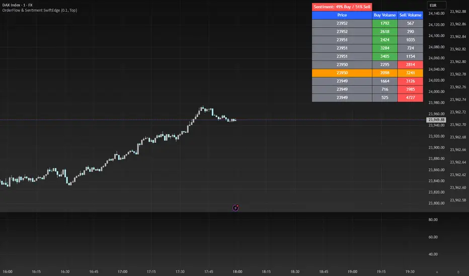
OrderFlow Sentiment SwiftEdgeOrderFlow Sentiment SwiftEdge
Overview
OrderFlow Sentiment SwiftEdge is a visual indicator designed to help traders analyze market dynamics through a simulated orderbook and market sentiment display. It breaks down the current candlestick into 10 price bins, estimating buy and sell volumes, and presents this data in an orderbook table alongside a sentiment row showing the buy vs. sell bias. This tool provides a quick and intuitive way to assess orderflow activity and market sentiment directly on your chart.
How It Works
The indicator consists of two main components: an Orderbook Table and a Market Sentiment Row.
Orderbook Table:
Simulates buy and sell volumes for the current candlestick by distributing total volume into 10 price bins based on price movement and proximity to open/close levels.
Displays the price bins in a table with columns for Price, Buy Volume, and Sell Volume, sorted from highest to lowest price.
Highlights the current price level in orange for easy identification, while buy and sell dominance is indicated with green (buy) or red (sell) backgrounds.
Market Sentiment Row:
Calculates the overall buy and sell sentiment (as a percentage) for the current candlestick based on the simulated orderflow data.
Displays the sentiment above the orderbook table, with the background colored green if buyers dominate or red if sellers dominate.
Features
Customizable Colors: Choose colors for buy (default: green), sell (default: red), and current price (default: orange) levels.
Lot Scaling Factor: Adjust the volume scaling factor (default: 0.1 lots per volume unit) to simulate realistic lot sizes.
Table Position: Select the table position on the chart (Top, Middle, or Bottom; default: Middle).
Default Properties
Positive Color: Green
Negative Color: Red
Current Price Color: Orange
Lot Scaling Factor: 0.1
Table Position: Middle
Usage
This indicator is ideal for traders who want to visualize orderflow dynamics and market sentiment in real-time. The orderbook table provides a snapshot of buy and sell activity at different price levels within the current candlestick, helping you identify areas of high buying or selling pressure. The sentiment row offers a quick overview of market bias, allowing you to gauge whether buyers or sellers are currently dominating. Use this information to complement your trading decisions, such as identifying potential breakout levels or confirming trend direction.
Limitations
This indicator simulates orderflow data based on candlestick price movement and volume, as TradingView does not provide tick-by-tick data. The volume distribution is an approximation and should be used as a visual aid rather than a definitive measure of market activity.
The indicator operates on the chart's current timeframe and does not incorporate higher timeframe data.
The simulated volumes are scaled using a user-defined lot scaling factor, which may not reflect actual market lot sizes.
Disclaimer
This indicator is for informational purposes only and does not guarantee trading results. Always conduct your own analysis and manage risk appropriately. The simulated orderflow data is an estimation and may not reflect real market conditions.
Swing Trade TarayıcıSwing Trade Scanner (v6) User Guide
1. Purpose:
This TradingView indicator (written in Pine Script v6) is designed to help identify swing trading opportunities. It calculates an overall trend strength and direction score by combining multiple technical analyses for up to 20 financial assets (stocks, cryptocurrencies, forex, etc.) that you specify. It presents the results in a customizable table, allowing you to quickly scan the market.
2. Analyses Used and Their Roles:
By default, the indicator uses the following 4 main technical analyses:
EMA Crossover (Default: 9/21): Used to capture short-term trend direction and potential momentum shifts. When the fast EMA (9) crosses above the slow EMA (21), it's considered a bullish signal; when it crosses below, it's a bearish signal. It's often one of the main entry/exit triggers.
RSI (Relative Strength Index - Default: 14): Measures the speed of price movements to identify overbought (OB) and oversold (OS) conditions. Reversals from the OB zone can signal potential downturns, while reversals from the OS zone can signal potential upturns. It also provides insight into the strength of the momentum.
MACD (Moving Average Convergence Divergence - Default: 12, 26, 9): A trend-following momentum indicator. The relationship between the MACD line and the signal line (crossovers) and the state of the histogram (position relative to the zero line) are used to confirm momentum shifts and trend strength.
ADX/DI (Average Directional Index - Default: 14, 14): Measures the strength (ADX) and direction (+DI/-DI lines) of a trend. Its main role is to filter signals from other indicators. A trend is considered to exist if the ADX is above a certain threshold (e.g., 25). +DI above -DI indicates an uptrend, and the reverse indicates a downtrend.
3. Scoring System:
The indicator calculates an individual score for each analysis and then combines these scores using weights you define to create a final Trend Score:
Individual Scores: Each analysis (EMA, RSI, MACD, ADX/DI) generates a decimal score between -1.0 (Strong Negative/Bearish) and +1.0 (Strong Positive/Bullish) based on its own rules. For example, RSI might score +1.0 if oversold, -1.0 if overbought, and 0.0 if neutral. MACD and ADX/DI scores can also take intermediate values reflecting both direction and strength (e.g., ±1.0, ±0.6, ±0.3, 0.0).
Weighting: In the settings, you can assign a weight (between 0.0 and 1.0) to each analysis, determining how much it influences the final score. For instance, you might give EMA crossover a higher weight and use RSI with a lower weight.
Total Score: The individual scores of the active analyses are multiplied by their assigned weights and summed up. This total is then divided by the sum of the weights of the active analyses to obtain a final, normalized Trend Score between -1.0 and +1.0. This score represents the combined view of all analyses.
4. Trend Determination:
The calculated final Trend Score is classified into an overall TREND status based on threshold values you set in the settings:
S.UP (Strong Up): Score > Strong Up Threshold (Default: 0.70)
UP: Up Threshold < Score <= Strong Up Threshold (Default: 0.35 < Score <= 0.70)
NEUTRAL: Down Threshold <= Score <= Up Threshold (Default: -0.35 <= Score <= 0.35)
DOWN: Strong Down Threshold <= Score < Down Threshold (Default: -0.70 <= Score < -0.35)
S.DOWN (Strong Down): Score < Strong Down Threshold (Default: -0.70)
This classification allows you to see at a glance which assets have strong trend potential.
5. Table Structure and Meanings:
The indicator displays the results in a table with the following columns:
TICKER: The symbol of the analyzed asset (abbreviated).
TREND: The overall trend status determined by the total score (S.UP, UP, NEUTRAL, DOWN, S.DOWN). The background color of this column also reflects this overall trend (Dark Green, Green, Gray, Red, Dark Red).
SCORE: The calculated weighted total score (between -1.00 and +1.00, with two decimal places). The background color of this column also reflects the overall trend.
EMA: Shows the result of only the EMA 9/21 analysis.
▲: EMA(9) > EMA(21) (Green Background)
▼: EMA(9) < EMA(21) (Red Background)
N: Neutral (Gray Background)
-: Analysis disabled or no data (Pale Gray Background)
RSI: Shows the result of only the RSI analysis.
OS: Oversold (RSI < 30) (Green Background)
M+: Mid Positive (30 <= RSI < 45) (Light Green/Lime Background)
N: Neutral (45 <= RSI <= 55) (Gray Background)
M-: Mid Negative (55 < RSI <= 70) (Orange Background)
OB: Overbought (RSI > 70) (Red Background)
-: Analysis disabled or no data (Pale Gray Background)
MACD: Shows the result of only the MACD analysis.
S+: Strong Positive (MACD > Signal AND Histogram > 0) (Green Background)
M+: Mid Positive (MACD > Signal BUT Histogram < 0) (Light Green/Lime Background)
N: Neutral (Other cases) (Gray Background)
M-: Mid Negative (MACD < Signal BUT Histogram > 0) (Orange Background)
S-: Strong Negative (MACD < Signal AND Histogram < 0) (Red Background)
-: Analysis disabled or no data (Pale Gray Background)
ADX/DI: Shows the result of only the ADX/DI analysis.
S+: Strong Uptrend (ADX > 40 AND +DI > -DI) (Green Background)
M+: Mid Uptrend (25 < ADX <= 40 AND +DI > -DI) (Light Green/Lime Background)
W: Weak Trend (ADX <= 25) (Gray Background)
M-: Mid Downtrend (25 < ADX <= 40 AND -DI > +DI) (Orange Background)
S-: Strong Downtrend (ADX > 40 AND -DI > +DI) (Red Background)
-: Analysis disabled or no data (Pale Gray Background)
6. Settings (Inputs):
You can customize the indicator's behavior using the following settings:
General Settings:
Analysis Timeframe: Select the timeframe for the scans (Leave blank to use the chart timeframe).
Auto Adjust Parameters and Weights: If checked, predefined parameters and weights based on the selected timeframe (1h, 4h, 1D, 1W) are used. If unchecked, or if an unsupported timeframe is selected, the manual settings below apply.
Strong/Normal Up/Down Thresholds: Adjust the score thresholds used to determine the TREND column.
Analysis Settings (Separate Group for Each Analysis):
Enable ... Analysis: Check to include the respective analysis in the score.
... Weight (Manual): If auto-adjust is off, set the weight of this analysis in the total score.
... Period/Level (Manual): If auto-adjust is off, adjust the parameters (period, level, etc.) of the respective indicator.
Symbols (1-10):
Checkbox: Check to include the respective symbol in the scan.
Text Box: Enter the symbol of the asset you want to analyze (e.g., "NASDAQ:AAPL", "BINANCE:BTCUSDT").
Table Settings:
Table Position: Choose where the table appears on the chart.
Cell Width: Adjust the width of the table cells.
Text Size: Select the general size of the text in the table (individual analysis columns are usually shown one size smaller).
7. How to Use:
Add the indicator to your TradingView chart.
Enter the indicator settings.
In the Symbols section, enter the symbols of the assets you want to analyze and check the boxes next to them.
In the General Settings section, select your desired Analysis Timeframe.
Decide whether the Auto Adjust Parameters and Weights option should be checked. If not, adjust the manual parameters and weights for each indicator in the Analysis Settings section according to your strategy.
Examine the table:
The TREND and SCORE columns give you a general overview. Focus on strong signals (S.UP, S.DOWN) or states that have just crossed thresholds (UP, DOWN).
The EMA, RSI, MACD, ADX/DI columns allow you to see in detail which analyses influenced the overall score. You can track confirming or conflicting signals here.
Combine these scan results with other rules of your swing trading strategy (support/resistance, patterns, risk management, etc.) to make trading decisions.
8. Important Notes:
This indicator does not constitute financial advice. It is merely a tool that combines technical analysis tools to help you scan the market.
The default parameters and weights in the indicator settings are for general use. For best results, it is strongly recommended that you optimize these settings by backtesting them on historical data according to your own strategy, the assets you trade, and market conditions.
No technical indicator or system generates 100% accurate signals. Always apply risk management principles and do not trade with money you cannot afford to lose.
I hope this guide helps you use the indicator effectively!

3CRGANG - TRUE RANGEThis indicator helps traders identify key support and resistance levels using dynamic True Range calculations, while also providing a multi-timeframe trend overview. It plots True Range levels as horizontal lines, marks breakouts with arrows, and displays trend directions across various timeframes in a table, making it easier to align trades with broader market trends.
What It Does
The 3CRGANG - TRUE RANGE indicator calculates dynamic support and resistance levels based on the True Range concept, updating them as price breaks out of the range. It also analyzes trend direction across multiple timeframes (M1 to M) and presents the results in a table, using visual cues to indicate bullish, bearish, or neutral conditions.
Why It’s Useful
This script combines True Range analysis with multi-timeframe trend identification to provide a comprehensive tool for traders. The dynamic True Range levels help identify potential reversal or continuation zones, while the trend table allows traders to confirm the broader market direction before entering trades. This dual approach reduces the need for multiple indicators, streamlining analysis across different timeframes and market conditions.
How It Works
The script operates in the following steps:
True Range Calculation: The indicator calculates True Range levels (support and resistance) using price data (close, high, low) from a user-selected timeframe. It updates these levels when price breaks above the upper range (bullish breakout) or below the lower range (bearish breakout).
Line Plotting: Two styles are available:
"3CR": Plots one solid line after a breakout (green for bullish, red for bearish) and removes the opposing line.
"RANGE": Plots both upper and lower range lines as dotted lines (green for support, red for resistance) until a breakout occurs, then solidifies the breakout line.
Multi-Timeframe Trend Analysis: The script analyzes trend direction on multiple timeframes (M1, M5, M15, M30, H1, H4, D, W, M) by comparing the current close to the True Range levels on each timeframe. A trend is:
Trend Table: A table displays the trend direction for each timeframe, with color-coded backgrounds (green for bullish, red for bearish) and triangles to indicate the trend state.
Breakout Arrows: When price breaks above the upper range, a green ▲ arrow appears below the bar (bullish). When price breaks below the lower range, a red ▼ arrow appears above the bar (bearish).
Bullish (▲): Price is above the upper range.
Bearish (▼): Price is below the lower range.
Neutral (△/▽): Price is within the range, with the last trend indicated by an empty triangle (△ for last bullish, ▽ for last bearish).
Alerts: Breakout alerts can be set for each timeframe, with options to filter by trading sessions (e.g., New York, London) or enable all-day alerts.
Underlying Concepts
The script uses the True Range concept to define dynamic support and resistance levels, which adjust based on price action to reflect the most relevant price zones. The multi-timeframe trend analysis leverages the same True Range logic to determine trend direction, providing a consistent framework across all timeframes. The combination of breakout signals and trend confirmation helps traders align their strategies with both short-term price movements and longer-term market trends.
Use Case
Breakout Trading: Use the True Range lines and arrows to identify breakouts. For example, a green ▲ arrow below a bar with price breaking above the upper range suggests a potential long entry.
Trend Confirmation: Check the trend table to ensure the breakout aligns with the broader trend. For instance, a bullish breakout on the 1H chart is more reliable if the D and W timeframes also show bullish trends (▲).
Range Trading: When price is within the True Range (dotted lines in "RANGE" style), consider range-bound strategies, buying near support and selling near resistance, while monitoring the table for potential trend shifts.
Settings
Input Timeframe: Select the timeframe for True Range calculations (default: chart timeframe).
True Range Style: Choose between "3CR" (single line after breakout) or "RANGE" (both lines until breakout) (default: 3CR).
Change Symbol: Compare a different ticker if needed (default: chart symbol).
Color Theme: Select "LIGHT THEME" or "DARK THEME" for colors, or enable custom colors (default: LIGHT THEME).
Table Position: Set the trend table’s position (center, right, left) (default: right).
Multi Res Alerts Setup: Enable/disable breakout alerts for each timeframe (default: enabled for most timeframes).
Sessions Alerts: Filter alerts by trading sessions (e.g., New York, London) or enable all-day alerts (default: most sessions enabled).
Chart Notes
The chart displays the script’s output on XAUUSD (1H timeframe), showing:
Candlesticks representing price action.
True Range lines (green for support, red for resistance) in "3CR" style, with solid lines after breakouts and dotted lines during range-bound periods.
Arrows (green ▲ below bars for bullish breakouts, red ▼ above bars for bearish breakouts) indicating range breakouts.
A trend table in the top-right corner labeled "TREND EA," showing trend directions across timeframes (M1 to M) with triangles (▲/▼ for active trends, △/▽ for last trend) and color-coded backgrounds (green for bullish, red for bearish).
Notes
The script uses the chart’s ticker by default but allows comparison with another symbol if enabled.
Trend data for higher timeframes (e.g., M) may not display if the chart’s history is insufficient.
Alerts are triggered only during selected trading sessions unless "ALL DAY ALERTS" is enabled.
Disclaimer
This indicator is a tool for analyzing market trends and does not guarantee trading success. Trading involves risk, and past performance is not indicative of future results. Always use proper risk management.

Statistical OHLC Projections [neo|]█ OVERVIEW
Statistical OHLC Projections is an indicator designed to offer users a customizable deep-dive on measuring historical price levels for any timeframe. The indicator separates price into two distinct levels, "Manipulation" and "Distribution", where the idea is that for higher timeframe candles, e.g. an up-close candle, the distance from the open to the bottom of the wick would constitute the Manipulation, and the rest would be considered the Distribution. By measuring out these levels, we can gain insight on how far the market may move from higher timeframe opens to their manipulations and distributions, and apply this knowledge to our analysis.
IMPORTANT: Since levels are based on the lookback available on your chart, if the levels aren't being displayed this likely means you don't have enough lookback for your selected timeframe. To check this, enable the stat table to see how many values are available for your timeframe, and either reduce the lookback or increase your chart timeframe.
█ CONCEPTS
The core concept revolves around understanding market behavior through the lens of historical candle structure. The indicator dissects OHLC data to provide statistical boundaries of expected price movement.
- Manipulation Levels: These represent the areas typically seen as liquidity grabs or false moves where price extends in one direction before reversing.
- Distribution Levels: These highlight where the bulk of directional movement tends to occur, often following the manipulation move.
The tool aggregates this data across your selected timeframe to inform you of potential levels associated with it.
█ FEATURES
Multiple Display Types: Display statistical data through two sleek styles, areas or lines. Where areas represent the area between two customizable lookback values, and lines represent one average value.
Adjustable Timeframe Selection: Whether you want to see data based on the 1D chart, or the 1W chart, anything is possible. Simply change the timeframe on the dropdown menu and if there is sufficient lookback the indicator will adjust to your requested timeframe.
Customizable Historical Lookback: By default, the indicator will measure the average 60 values of your requested timeframe, however this may be adjusted to be higher or lower based on your preference. If you want to measure recent moves, 10-20 lookback may be better for you, or if you want more data for less volatile instruments, a value of 100 may be better.
Historical Display: Prevent historical levels from being removed by unchecking the "Remove Previous Drawings" option, this will allow you to examine how the levels previously interacted with price.
NY Midnight Anchoring: By checking the "Use NY Midnight" option, you may see the projection anchored to the New York midnight open time, which is often a significant level on indices.
Alerts: You may enable alerts for any of the indicator's provided levels to stay informed, even when off the charts.
█ How to use
To use the indicator, simply apply it to your chart and modify any of your desired inputs.
By default, the indicator will provide levels for the "1D" timeframe, with a desired lookback of 60, on most instruments and plans this can be gotten when you are on the 30 minute timeframe or above.
When price reaches or extends beyond a manipulation level, observe how it reacts and whether it rejects from that level, if it does this may be an indication that the candle for the timeframe you selected may be reversing.
█ SETTINGS AND OPTIONS
Customize the indicator’s behavior, timeframe sources, and visual appearance to fit your analysis style. Each setting has been designed with flexibility in mind, whether you're working on lower or higher timeframes.
Display Mode: Switch between different display styles for levels: - Default: Shows all statistical levels as individual lines.
- Areas: Plots filled zones between two customizable lookbacks to represent the range between them.
This is ideal for visually mapping high-probability zones of price activity.
Timeframe Settings:
- Show First/Second Timeframe: Choose to show one or both timeframe projections simultaneously.
- First Timeframe / Second Timeframe: Define the higher timeframe candle you want to base calculations on (e.g., 1D, 1W).
- Use NY Midnight: When enabled and using the daily timeframe, the levels will be anchored to the New York Midnight Open (00:00 EST), a key institutional timing reference, especially useful for indices and forex.
Calculation Settings:
- Main Lookback Period: The number of historical candles used in the statistical calculations. A lower number focuses on recent price action, while a higher number smooths results across broader history.
- First Lookback / Second Lookback: Used when “Areas” mode is selected to define the range of the shaded zone. For example, an area from 20 to 60 candles creates a band between short- and long-term price behavior averages.
Visual Settings:
- Line Style: Set your preferred visual style: Solid, Dashed, or Dotted.
- Remove Previous Drawings: When enabled, only the most recent projection is shown on the chart. Disable to retain previous levels and visually backtest their reactions over time.
Color Settings:
Customize each level independently to match your chart theme:
- Manipulation High/Low
- Distribution High/Low
- Open Level
- Label Text Color
Premium/Discount Zones:
- Enable Premium/Discount Zones: Overlay price zones above and below equilibrium to visualize potential overbought (premium) and oversold (discount) areas.
- Premium/Discount Colors: Fully customizable zone colors for clarity and emphasis.
Table Settings:
- Show Statistics Table: Adds an on-chart table summarizing key levels from your active timeframe(s).
- Table Cell Color: Set the background color of the table cells for visibility.
- Table Position: Choose from preset chart locations to position the table where it works best for your layout.
Alerts:
Stay on top of price interactions with key levels even when you're away from the charts.
- Manipulation Hits (High)
- Manipulation Hits (Low)
- Distribution Hits (High)
- Distribution Hits (Low)

RSI Multi-Timeframe K2Indicator Name: RSI Multi-Timeframe Cross Indicator
Overview:
"RSI Multi-Timeframe Cross Indicator" is a versatile Pine Script (v5) tool developed for TradingView, designed for traders using multi-time frame analysis. It monitors the Relative Strength Index (RSI) cross its Simple Moving Average (SMA) on multiple time frames (1-minute, 5-minute, 15-minute, 30-minute, 1-hour, 4-hour and daily) to identify bullish and bearish conditions. The indicator overlays the signals on the chart and provides a customizable table to visualize the time frame conditions.
Key Features:
RSI Crossover Detection:
Monitors when the RSI crosses above (bullish trend) or below (bearish trend) its SMA on each selected time frame.
Uses constant state tracking to maintain a bullish/bearish state until an opposite crossover occurs.
Configurable Parameters:
RSI Length: Configurable period for calculating RSI (default: 14).
MA Length: Configurable period for SMA applied to RSI (default: 20).
Time Frame Controls:
Logical Switches: Independent switches ( use1m , use5m , etc.) to include/exclude each time frame in the signal logic.
Visualization Switches: Separate switches ( show1m , show5m , etc.) to show/hide each time frame in the table without affecting the logic.
Visuals:
Triangles: Green ascending triangles below the bars indicate bullish signals, red descending triangles above the bars indicate bearish signals.
Labels : Long (green) or Short (red) labels on the last confirmed bar when all enabled timeframes match.
Dynamic Table : A centered table at the bottom of the chart displaying the status of each timeframe with colored boxes (green for bullish, red for bearish). The table size is adjustable based on the visible timeframes.
Alerts :
Trigger alerts when all enabled timeframes are bullish ("All RSI timeframes are bullish (green)!") or bearish ("All RSI timeframes are bearish (red)!").
Input Parameters:
RSI Settings :
RSI Length : Integer (min: 1, default: 14) — Period for RSI calculation.
MA Length : Integer (min: 1, default: 20) — Period for SMA RSI.
Timeframe Logic Settings:
Use 1M in Logic, Use 5M in Logic, etc.: Boolean (default: true) - Enable/Disable each timeframe in signal calculation.
Timeframe Visualization Settings:
Show 1M in Table, Show 5M in Table, etc.: Boolean (default: true) - Show/Hide each timeframe in the table display.
Logic:
Bullish Condition: RSI crosses above SMA on a given timeframe, setting a bullish condition until a bearish crossover occurs.
Bearish Condition: RSI crosses below SMA on a given timeframe, setting a bearish condition until a bullish crossover occurs.
Combination signal: A Long or Short signal is generated only when all enabled timeframes (use the * switches) line up in the same direction (bullish or bearish).
Visualization: The table displays the status of each timeframe, but only shows the fields for the timeframes with the Show* switch enabled.
Visual output:
Chart signals:
A green ascending triangle and a Long label when all enabled timeframes are bullish.
A red downward-pointing triangle and a Short label when all enabled timeframes are bearish.
Table:
Located in the lower center of the chart.
The bars dynamically adjust to the number of visible timeframes (1 to 7).
Each cell displays the time frame name (e.g. "1M", "5M") with a background color indicating its status (green for bullish, red for bearish).
Use:
Trend Confirmation: Used to confirm trends across multiple time frames based on RSI behavior.
Configure: Customize RSI and MA lengths to suit your trading strategy, and turn time frames on/off for both logic and visualization to focus on the relevant periods.
Alerts: Set up alerts to be notified when all selected time frames match, useful for automated trading systems or manual monitoring.
Notes:
The indicator does not display RSI or SMA lines directly on the chart, focusing instead on crossover events and signals.
If all visualization toggles are disabled, the table disappears, but signals and alerts continue to function based on the logic toggles.
Compatible with any chart timeframe, data from later timeframes is retrieved using request.security() .
Enhanced Volume Spike ScannerEnhanced Volume Spike Scanner – User Instructions
Overview
This TradingView indicator monitors the trading volume of a list of selected tickers and detects “volume spikes” by comparing the current volume against a simple moving average (SMA) of past volumes. It calculates a “spike strength” (the ratio of current volume to average volume) and assigns a color based on its intensity. The indicator then displays a sorted table on your chart with each ticker’s symbol, spike value, and current volume. Alerts can be triggered if a ticker’s spike strength reaches specific color-coded levels.
How It Works
1. Volume Calculation:
• For each ticker, the indicator fetches the current volume and calculates its simple moving average (SMA) over a user-defined lookback period.
• The ratio of the current volume to the SMA (spike strength) is computed.
2. Color Coding:
• A color is assigned based on the spike strength:
• >5.0: Orange
• >4.0: Yellow
• >3.0: Green
• >2.5: Lime
• >2.0: Blue
• Otherwise: Pink
• These colors serve as visual cues for the intensity of the volume spike.
3. Table Display:
• All tickers are listed in a table on the chart.
• The table is sorted in descending order of spike strength so that the tickers with the strongest volume spikes appear at the top.
• Each row displays the ticker symbol, its spike value (formatted to two decimal places), and the current volume.
4. Alerts:
• You can enable alerts for each color level (e.g., Orange for the most intense spikes).
• Alerts trigger once per bar for any ticker that meets the criteria, allowing you to react promptly to significant volume changes.
⸻
User Inputs and Customization
• Volume Spike Multiplier:
Set the threshold for what constitutes a spike (e.g., a value of 2.0 means the current volume must be at least twice the SMA to be considered a spike).
• Volume Lookback Period:
Define how many bars to use when calculating the SMA of the volume.
• Minimum Volume Filter:
Optionally enable a filter to ignore low-volume ticks. Specify the minimum volume that must be reached for a ticker to be considered.
• Table Settings:
Adjust parameters like column width, table number, and vertical positioning to suit your chart layout.
• Alert Settings:
Toggle alerts for each spike intensity level. Only tickers that meet the specified color threshold will trigger an alert.
• Color Inputs:
Customize the colors for each spike intensity level using the color input settings.
• Ticker Inputs:
Update the ticker symbols manually in the input section (Ticker 1, Ticker 2, etc.) to monitor the assets you are interested in.
⸻
Using the Indicator
1. Add the Indicator:
Once added to your chart, the table will appear at the top-right corner. You can reposition it using the “Table Number” or “Move Down” inputs.
2. Monitor the Table:
Watch the table update each bar:
• The Symbol column lists your selected tickers.
• The Spike column shows the spike strength along with its corresponding color (indicating intensity).
• The Volume column shows the current volume for each ticker.
3. React to Alerts:
If you have enabled alerts for a specific intensity, you’ll receive a notification (once per bar) when a ticker reaches that volume spike level.
4. Adjust Settings as Needed:
Experiment with the multipliers, lookback periods, and minimum volume thresholds to fine-tune the indicator for your trading style.
⸻
Uptrick Signal Density Cloud🟪 Introduction
The Uptrick Signal Density Cloud is designed to track market direction and highlight potential reversals or shifts in momentum. It plots two smoothed lines on the chart and fills the space between them (often called a “cloud”). The bars on the chart change color depending on bullish or bearish conditions, and small triangles appear when certain reversal criteria are met. A metrics table displays real-time values for easy reference.
🟩 Why These Features Have Been Linked Together
1) Dual-Line Structure
Two separate lines represent shorter- and longer-term market tendencies. Linking them in one tool allows traders to view both near-term changes and the broader directional bias in a single glance.
2) Smoothed Averages
The script offers multiple smoothing methods—exponential, simple, hull, and an optimized approach—to reduce noise. Using more than one type of moving average can help balance responsiveness with stability.
3) Density Cloud Concept
Shading the region between the two lines highlights the gap or “thickness.” A wider gap typically signals stronger momentum, while a narrower gap could indicate a weakening trend or potential market indecision. When the cloud is too wide and crosses a certain threshold defined by the user, it indicates a possible reversal. When the cloud is too narrow it may indicate a potential breakout.
🟪 Why Use This Indicator
• Trend Visibility: The color-coded lines and bars make it easier to distinguish bullish from bearish conditions.
• Momentum Tracking: Thicker cloud regions suggest stronger separation between the faster and slower lines, potentially indicating robust momentum.
• Possible Reversal Alerts: Small triangles appear within thick zones when the indicator detects a crossover, drawing attention to key moments of potential trend change.
• Quick Reference Table: A metrics table shows line values, bullish or bearish status, and cloud thickness without needing to hover over chart elements.
🟩 Inputs
1) First Smoothing Length (length1)
Default: 14
Defines the lookback period for the faster line. Lower values make the line respond more quickly to price changes.
2) Second Smoothing Length (length2)
Default: 28
Defines the lookback period for the slower line or one of the moving averages in optimized mode. It generally responds more slowly than the faster line.
3) Extra Smoothing Length (extraLength)
Default: 50
A medium-term period commonly seen in technical analysis. In optimized mode, it helps add broader perspective to the combined lines.
4) Source (source)
Default: close
Specifies the price data (for example, open, high, low, or a custom source) used in the calculations.
5) Cloud Type (cloudType)
Options: Optimized, EMA, SMA, HMA
Determines the smoothing method used for the lines. “Optimized” blends multiple exponential averages at different lengths.
6) Cloud Thickness Threshold (thicknessThreshold)
Default: 0.5
Sets the minimum separation between the two lines to qualify as a “thick” zone, indicating potentially stronger momentum.
🟪 Core Components
1) Faster and Slower Lines
Each line is smoothed according to user preferences or the optimized technique. The faster line typically reacts more quickly, while the slower line provides a broader overview.
2) Filled Density Cloud
The space between the two lines is filled to visualize in which direction the market is trending.
3) Color-Coded Bars
Price bars adopt bullish or bearish colors based on which line is on top, providing an immediate sense of trend direction.
4) Reversal Triangles
When the cloud is thick (exceeding the threshold) and the lines cross in the opposite direction, small triangles appear, signaling a possible market shift.
5) Metrics Table
A compact table shows the current values of both lines, their bullish/bearish statuses, the cloud thickness, and whether the cloud is in a “reversal zone.”
🟩 Calculation Process
1) Raw Averages
Depending on the mode, standard exponential, simple, hull, or “optimized” exponential blends are calculated.
2) Optimized Averages (if selected)
The faster line is the average of three exponential moving averages using length1, length2, and extraLength.
The slower line similarly uses those same lengths multiplied by 1.5, then averages them together for broader smoothing.
3) Difference and Threshold
The absolute gap between the two lines is measured. When it exceeds thicknessThreshold, the cloud is considered thick.
4) Bullish or Bearish Determination
If sma1 (the faster line) is above sma2 (the slower line), conditions are deemed bullish; otherwise, they are bearish. This distinction is reflected in both bar colors and cloud shading.
5) Reversal Markers
In thick zones, a crossover triggers a triangle at the point of potential reversal, alerting traders to a possible trend change.
🟪 Smoothing Methods
1) Exponential (EMA)
Prioritizes recent data for quicker responsiveness.
2) Simple (SMA)
Takes a straightforward average of the chosen period, smoothing price action but often lagging more in volatile markets.
3) Hull (HMA)
Employs a specialized formula to reduce lag while maintaining smoothness.
4) Optimized (Blended Exponential)
Combines multiple EMA calculations to strike a balance between responsiveness and noise reduction.
🟩 Cloud Logic and Reversal Zones
Cloud thickness above the defined threshold typically signals exceeding momentum and can lead to a quick reversal. During these thick periods, if the width exceeds the defined threshold, small triangles mark potential reversal points. In order for the reversal shape to show, the color of the cloud has to be the opposite. So, for example, if the cloud is bearish, and exceeds momentum, defined by the user, a bullish signal appears. The opposite conditions for a bullish signal. This approach can help traders focus on notable changes rather than minor oscillations.
🟪 Bar Coloring and Layered Lines
Bars take on bullish or bearish tints, matching the faster line’s position relative to the slower line. The lines themselves are plotted multiple times with varying opacities, creating a layered, glowing look that enhances visibility without affecting calculations.
🟩 The Metrics Table
Located in the top-right corner of the chart, this table displays:
• SMA1 and SMA2 current values.
• Bullish or bearish alignment for each line.
• Cloud thickness.
• Reversal zone status (in or out of zone).
This numeric readout allows for a quick data check without hovering over the chart.
🟪 Why These Specific Moving Average Lengths Are Used
Default lengths of 14, 28, and 50 are common in technical analysis. Fourteen captures near-term price movement without overreacting. Twenty-eight, roughly double 14, provides a moderate smoothing level. Fifty is widely regarded as a medium-term benchmark. Multiplying each length by 1.5 for the slower line enhances separation when combined with the faster line.
🟩 Originality and Usefulness
• Multi-Layered Smoothing. The user can select from several moving average modes, including a unique “optimized” blend, possibly reducing random fluctuations in the market data.
• Combined Visual and Numeric Clarity. Bars, clouds, and a real-time table merge into a single interface, enabling efficient trend analysis.
• Focus on Significant Shifts. Thick cloud zones and triangles draw attention to potentially stronger momentum changes and plausible reversals.
• Flexible Across Markets. The adjustable lengths and threshold can be tuned to different asset classes (stocks, forex, commodities, crypto) and timeframes.
By integrating multiple technical concepts—cloud-based trend detection, color coding, reversal markers, and an immediate reference table—the Uptrick Signal Density Cloud aims to streamline chart reading and decision-making.
🟪 Additional Considerations
• Timeframes. Intraday, daily, and weekly charts each yield different signals. Adjust the smoothing lengths and threshold to suit specific trading horizons.
• Market Types. Though applicable across asset classes, parameters might need tweaking to address the volatility of commodities, forex pairs, or cryptocurrencies.
• Confirmation Tools. Pairing this indicator with volume studies or support/resistance analysis can improve the reliability of signals.
• Potential Limitations. No indicator is foolproof; sudden market shifts or choppy conditions may reduce accuracy. Cautious position sizing and risk management remain essential.
🟩 Disclaimers
The Uptrick Signal Density Cloud relies on historical price data and may lag sudden moves or provide false positives in ranging conditions. Always combine it with other analytical techniques and sound risk management. This script is offered for educational purposes only and should not be considered financial advice.
🟪 Conclusion
The Uptrick Signal Density Cloud blends trend identification, momentum assessment, and potential reversal alerts in a single, user-friendly tool. With customizable smoothing methods and a focus on cloud thickness, it visually highlights important market conditions. While it cannot guarantee predictive accuracy, it can serve as a comprehensive reference for traders seeking both a quick snapshot of the current trend and deeper insights into market dynamics.

Dynamic Intensity Transition Oscillator (DITO)The Dynamic Intensity Transition Oscillator (DITO) is a comprehensive indicator designed to identify and visualize the slope of price action normalized by volatility, enabling consistent comparisons across different assets. This indicator calculates and categorizes the intensity of price movement into six states—three positive and three negative—while providing visual cues and alerts for state transitions.
Components and Functionality
1. Slope Calculation
- The slope represents the rate of change in price action over a specified period (Slope Calculation Period).
- It is calculated as the difference between the current price and the simple moving average (SMA) of the price, divided by the length of the period.
2. Normalization Using ATR
- To standardize the slope across assets with different price scales and volatilities, the slope is divided by the Average True Range (ATR).
- The ATR ensures that the slope is comparable across assets with varying price levels and volatility.
3. Intensity Levels
- The normalized slope is categorized into six distinct intensity levels:
High Positive: Strong upward momentum.
Medium Positive: Moderate upward momentum.
Low Positive: Weak upward movement or consolidation.
Low Negative: Weak downward movement or consolidation.
Medium Negative: Moderate downward momentum.
High Negative: Strong downward momentum.
4. Visual Representation
- The oscillator is displayed as a histogram, with each intensity level represented by a unique color:
High Positive: Lime green.
Medium Positive: Aqua.
Low Positive: Blue.
Low Negative: Yellow.
Medium Negative: Purple.
High Negative: Fuchsia.
Threshold levels (Low Intensity, Medium Intensity) are plotted as horizontal dotted lines for visual reference, with separate colors for positive and negative thresholds.
5. Intensity Table
- A dynamic table is displayed on the chart to show the current intensity level.
- The table's text color matches the intensity level color for easy interpretation, and its size and position are customizable.
6. Alerts for State Transitions
- The indicator includes a robust alerting system that triggers when the intensity level transitions from one state to another (e.g., from "Medium Positive" to "High Positive").
- The alert includes both the previous and current states for clarity.
Inputs and Customization
The DITO indicator offers a variety of customizable settings:
Indicator Parameters
Slope Calculation Period: Defines the period over which the slope is calculated.
ATR Calculation Period: Defines the period for the ATR used in normalization.
Low Intensity Threshold: Threshold for categorizing weak momentum.
Medium Intensity Threshold: Threshold for categorizing moderate momentum.
Intensity Table Settings
Table Position: Allows you to position the intensity table anywhere on the chart (e.g., "Bottom Right," "Top Left").
Table Size: Enables customization of table text size (e.g., "Small," "Large").
Use Cases
Trend Identification:
- Quickly assess the strength and direction of price movement with color-coded intensity levels.
Cross-Asset Comparisons:
- Use the normalized slope to compare momentum across different assets, regardless of price scale or volatility.
Dynamic Alerts:
- Receive timely alerts when the intensity transitions, helping you act on significant momentum changes.
Consolidation Detection:
- Identify periods of low intensity, signaling potential reversals or breakout opportunities.
How to Use
- Add the indicator to your chart.
- Configure the input parameters to align with your trading strategy.
Observe:
The Oscillator: Use the color-coded histogram to monitor price action intensity.
The Intensity Table: Track the current intensity level dynamically.
Alerts: Respond to state transitions as notified by the alerts.
Final Notes
The Dynamic Intensity Transition Oscillator (DITO) combines trend strength detection, cross-asset comparability, and real-time alerts to offer traders an insightful tool for analyzing market conditions. Its user-friendly visualization and comprehensive alerting make it suitable for both novice and advanced traders.
Disclaimer: This indicator is for educational purposes and is not financial advice. Always perform your own analysis before making trading decisions.
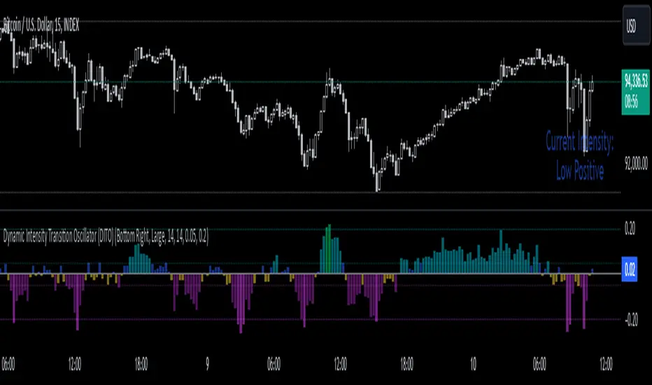
Average Price Range Screener [KFB Quant]Average Price Range Screener
Overview:
The Average Price Range Screener is a technical analysis tool designed to provide insights into the average price volatility across multiple symbols over user-defined time periods. The indicator compares price ranges from different assets and displays them in a visual table and chart for easy reference. This can be especially helpful for traders looking to identify symbols with high or low volatility across various time frames.
Key Features:
Multiple Symbols Supported:
The script allows for analysis of up to 10 symbols, such as major cryptocurrencies and market indices. Symbols can be selected by the user and configured for tracking price volatility.
Dynamic Range Calculation:
The script calculates the average price range of each symbol over three distinct time periods (default are 30, 60, and 90 bars). The price range for each symbol is calculated as a percentage of the bar's high-to-low difference relative to its low value.
Range Visualization:
The results are visually represented using:
- A color-coded table showing the calculated average ranges of each symbol and the current chart symbol.
- A line plot that visually tracks the volatility for each symbol on the chart, with color gradients representing the range intensity from low (red/orange) to high (blue/green).
Customizable Inputs:
- Length Inputs: Users can define the time lengths (default are 30, 60, and 90 bars) for calculating average price ranges for each symbol.
- Symbol Inputs: 10 symbols can be tracked at once, with default values set to popular crypto pairs and indices.
- Color Inputs: Users can customize the color scheme for the range values displayed in the table and chart.
Real-Time Ranking:
The indicator ranks symbols by their average price range, providing a clear view of which assets are exhibiting higher volatility at any given time.
Each symbol's range value is color-coded based on its relative volatility within the selected symbols (using a gradient from low to high range).
Data Table:
The table shows the average range values for each symbol in real-time, allowing users to compare volatility across multiple assets at a glance. The table is dynamically updated as new data comes in.
Interactive Labels:
The indicator adds labels to the chart, showing the average range for each symbol. These labels adjust in real-time as the price range values change, giving users an immediate view of volatility rankings.
How to Use:
Set Time Periods: Adjust the time periods (lengths) to match your trading strategy's timeframe and volatility preference.
Symbol Selection: Add and track the price range for your preferred symbols (cryptocurrencies, stocks, indices).
Monitor Volatility: Use the visual table and plot to identify symbols with higher or lower volatility, and adjust your trading strategy accordingly.
Interpret the Table and Chart: Ranges that are color-coded from red/orange (lower volatility) to blue/green (higher volatility) allow you to quickly gauge which symbols are most volatile.
Disclaimer: This tool is provided for informational and educational purposes only and should not be considered as financial advice. Always conduct your own research and consult with a licensed financial advisor before making any investment decisions.
